Stopping!

Hello Friends,

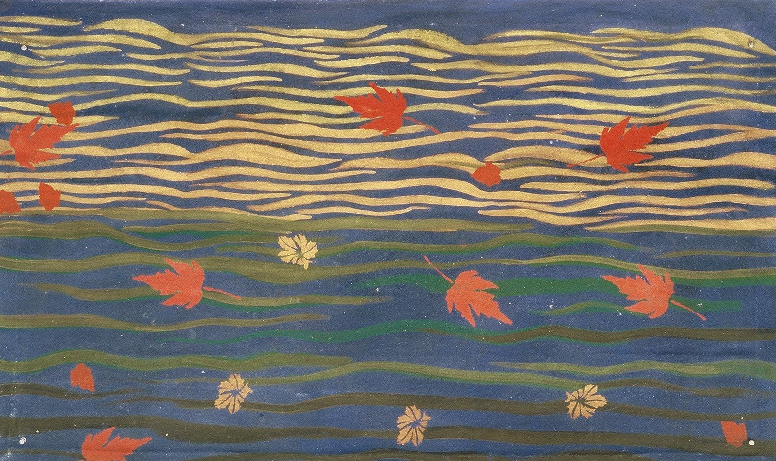
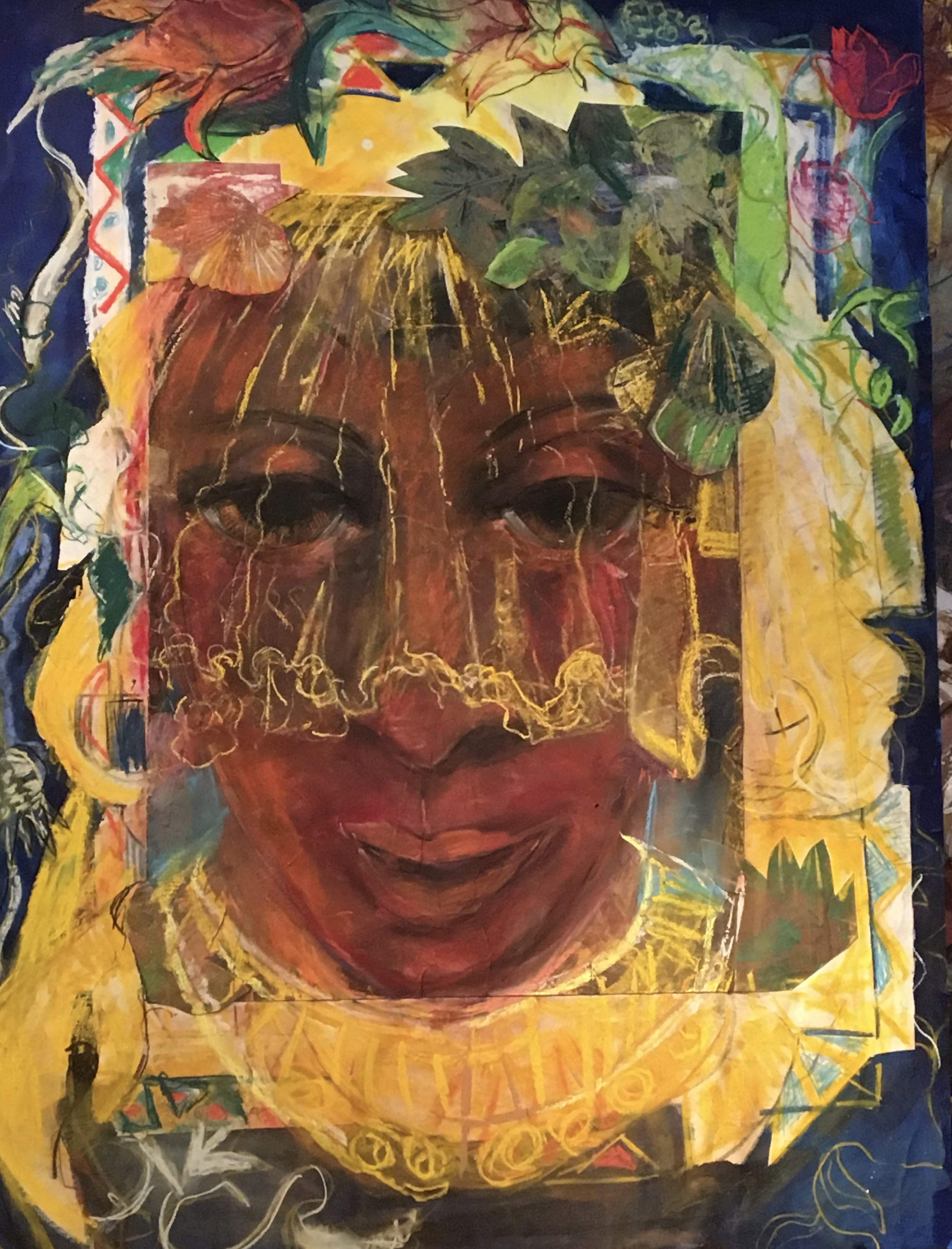
Good art makes us stop. It captures our attention. It calls us out of frantic schedules and activities, and obsessions. It calls us to what I think of as “active contemplation” - engaging with the beauty we can find in everyday life. And beauty is there! If we have eyes, and take the time, to see.

As art lovers, we have the opportunity to “stop and smell (and see!) the roses” and so much more! Not only in nature but in the people around us. Let yourself “be arrested!” It’s so easy to get caught up in ourselves that we don’t see the selves around us; we don’t see and seize the chances for self-giving and the freedom, joy, and healing that it brings.

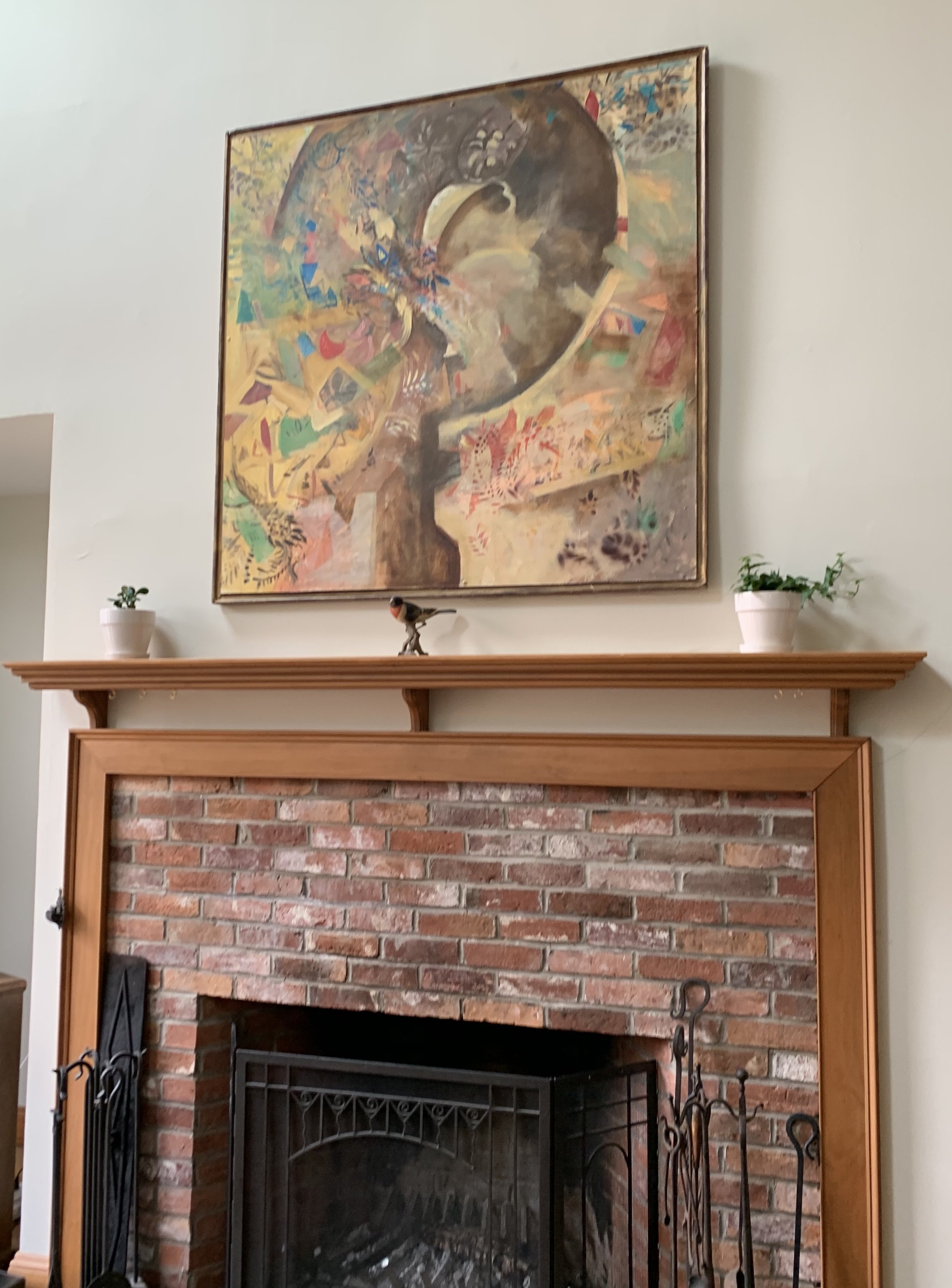
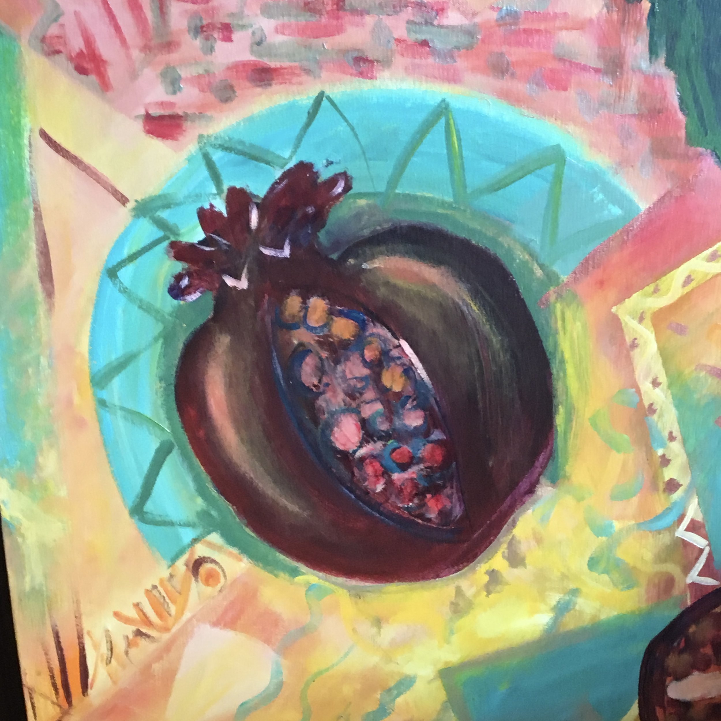
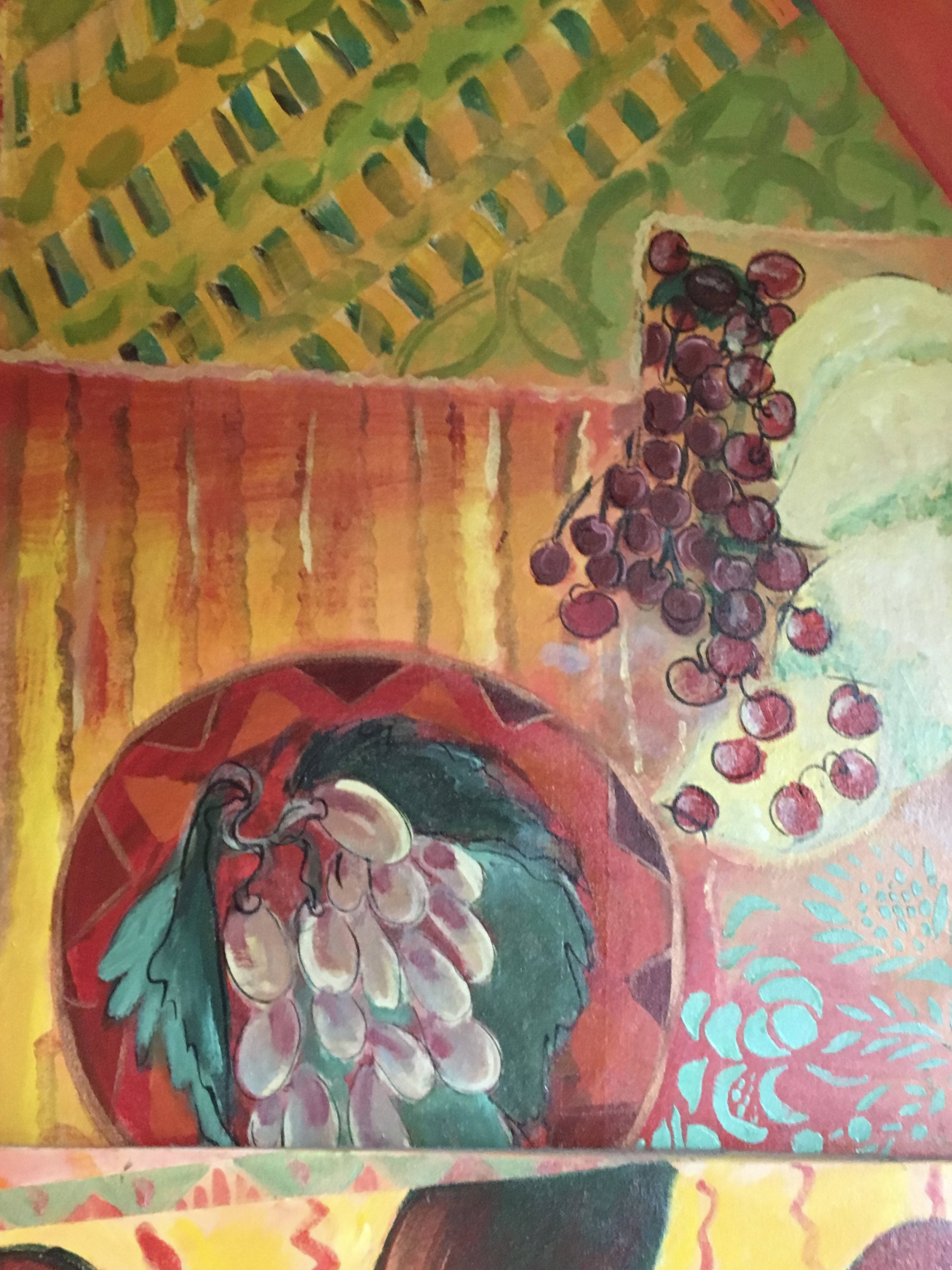
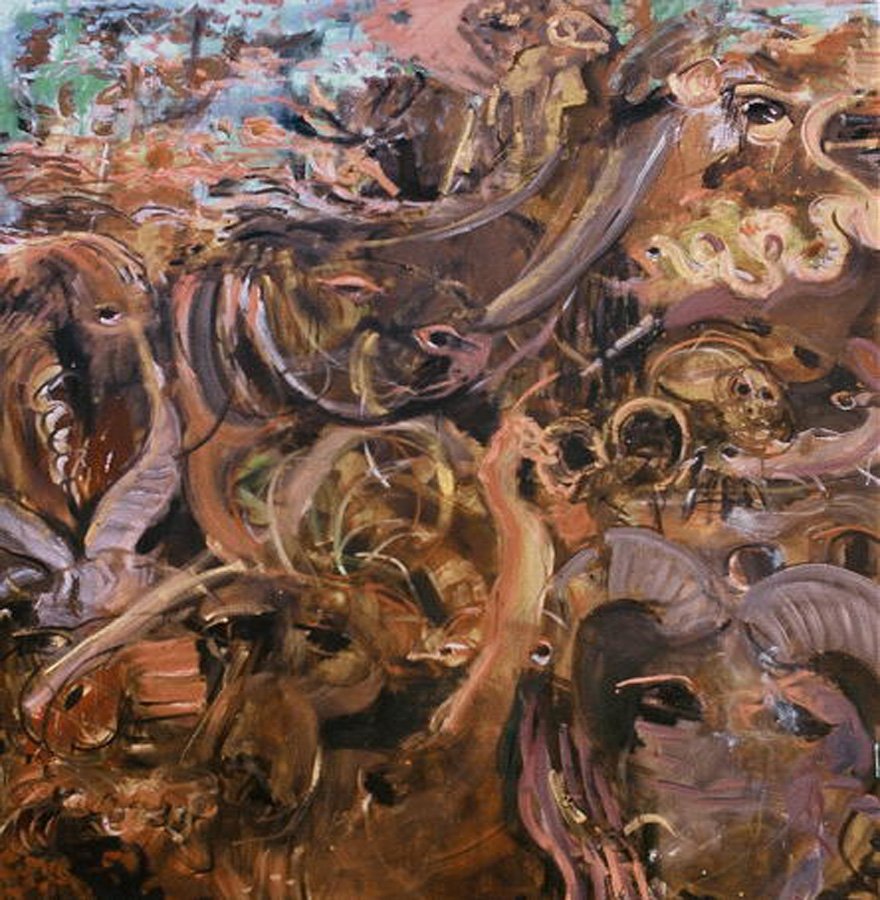
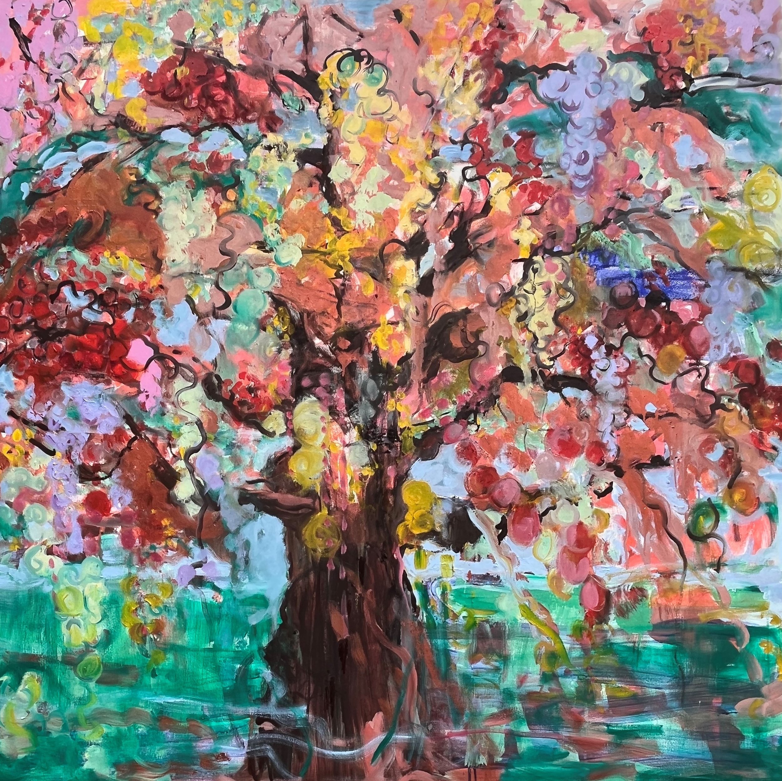
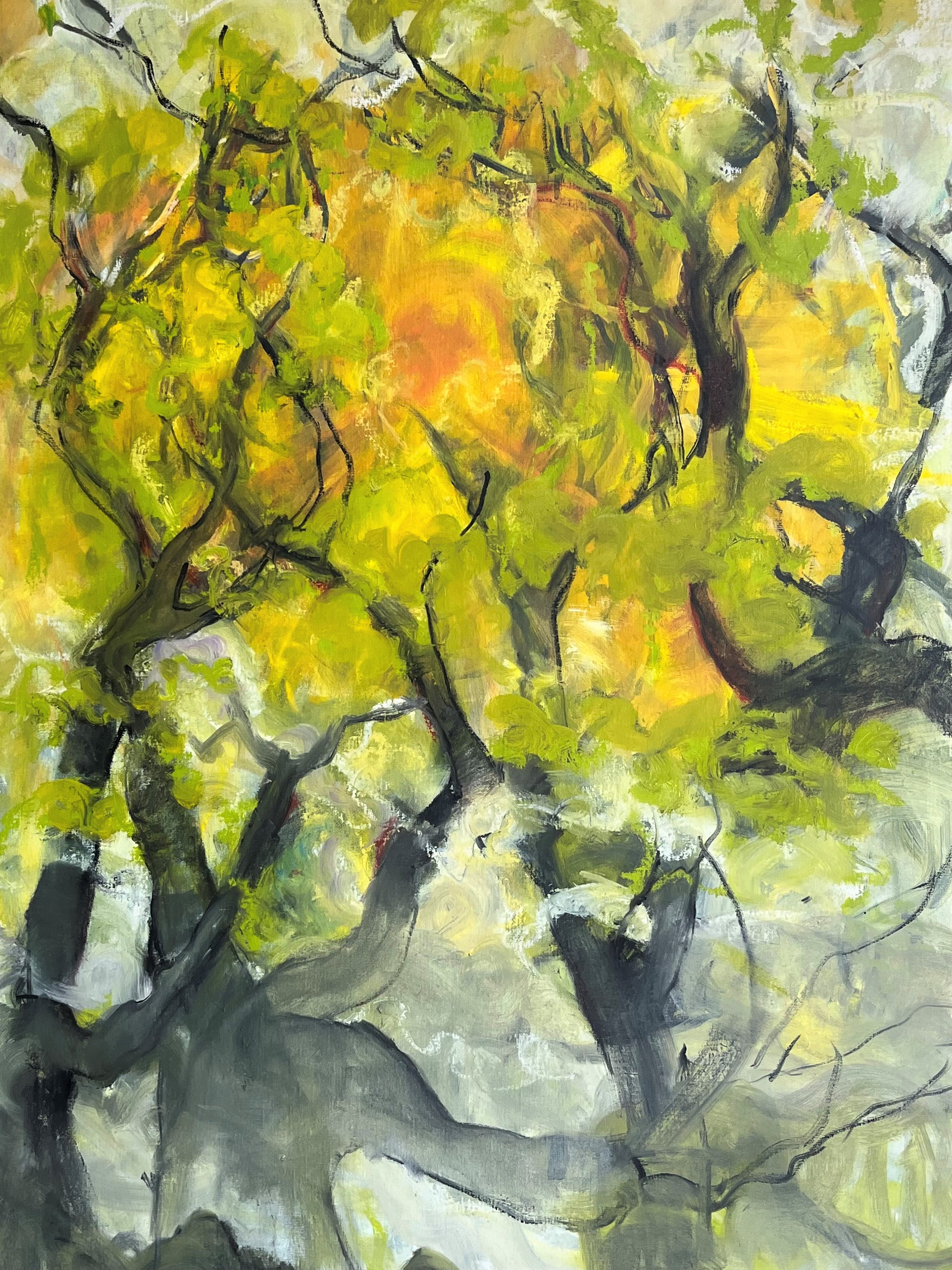
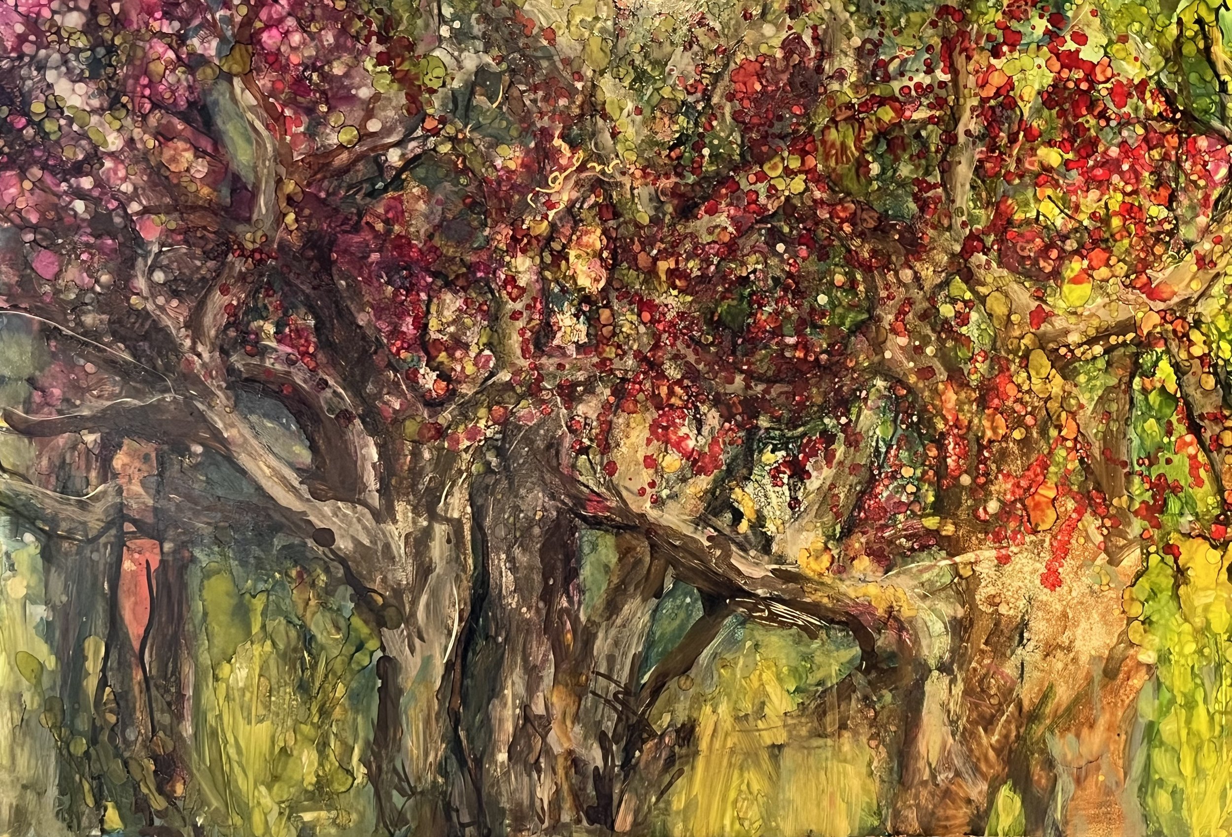
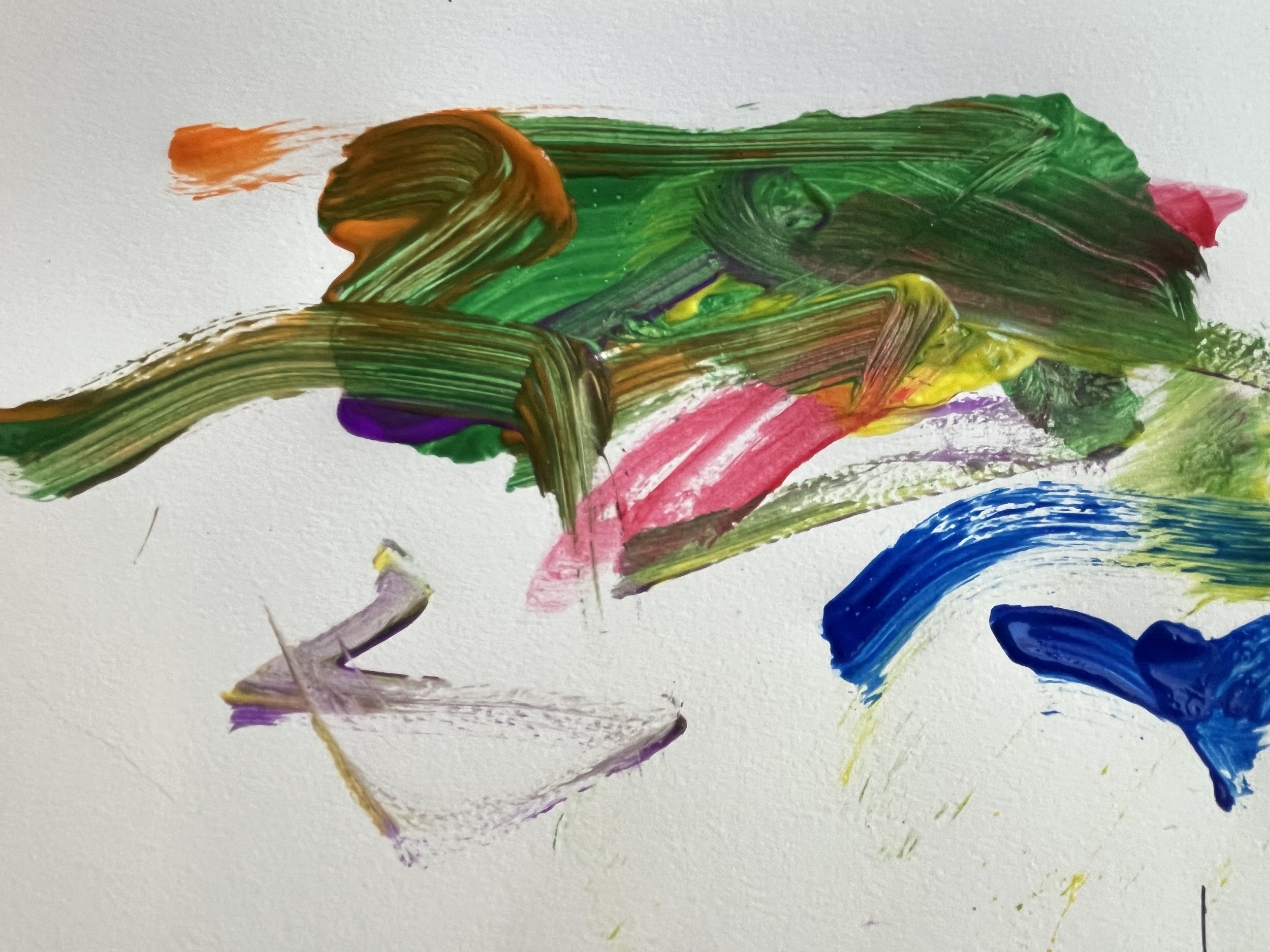
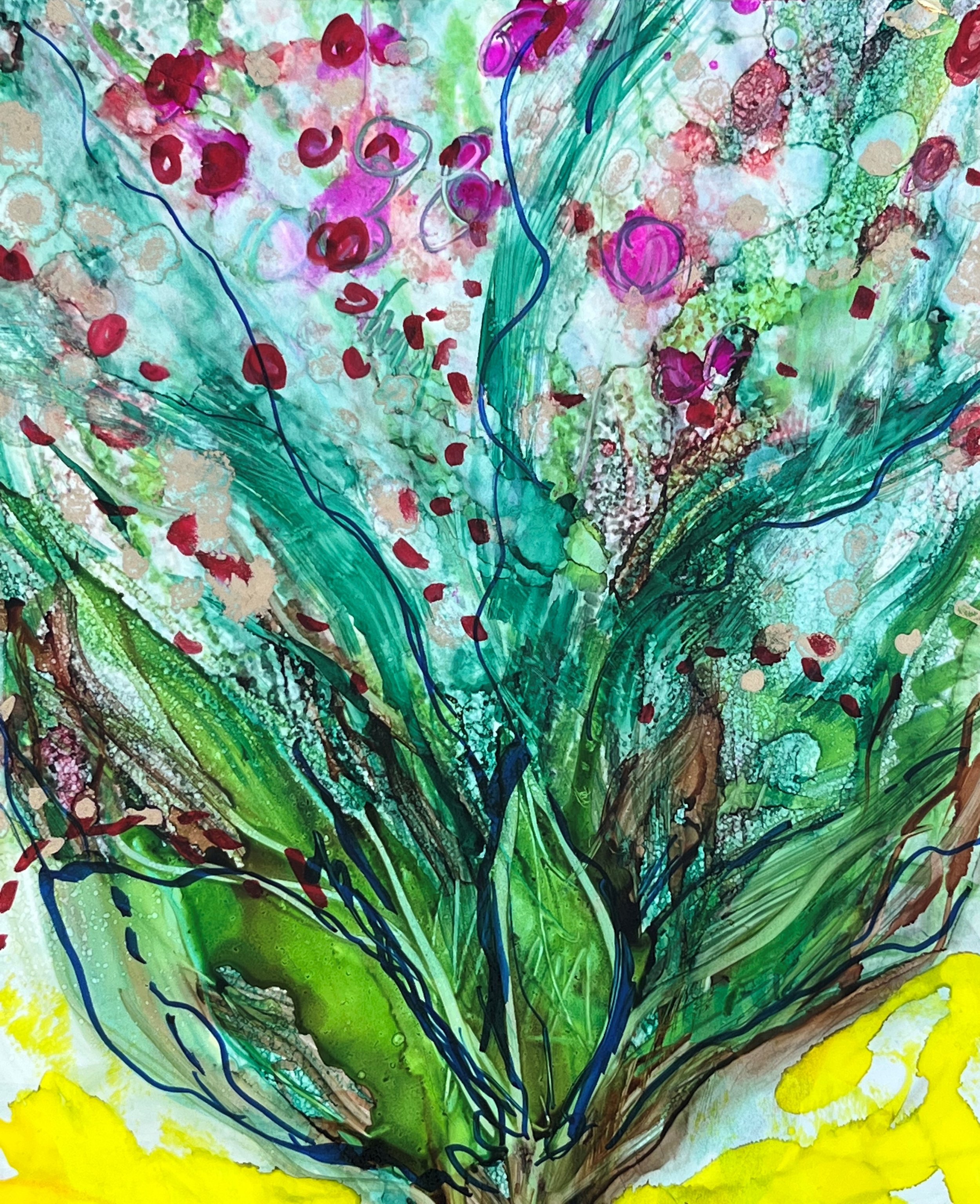
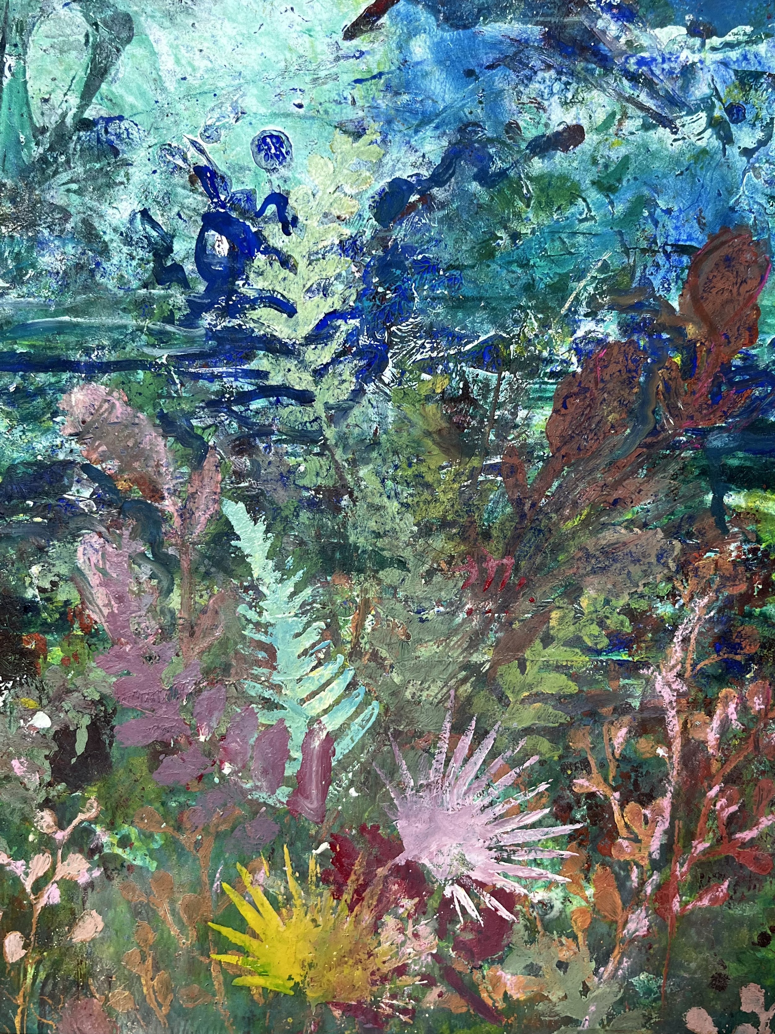
Sometimes life is hidden in unlikely places.

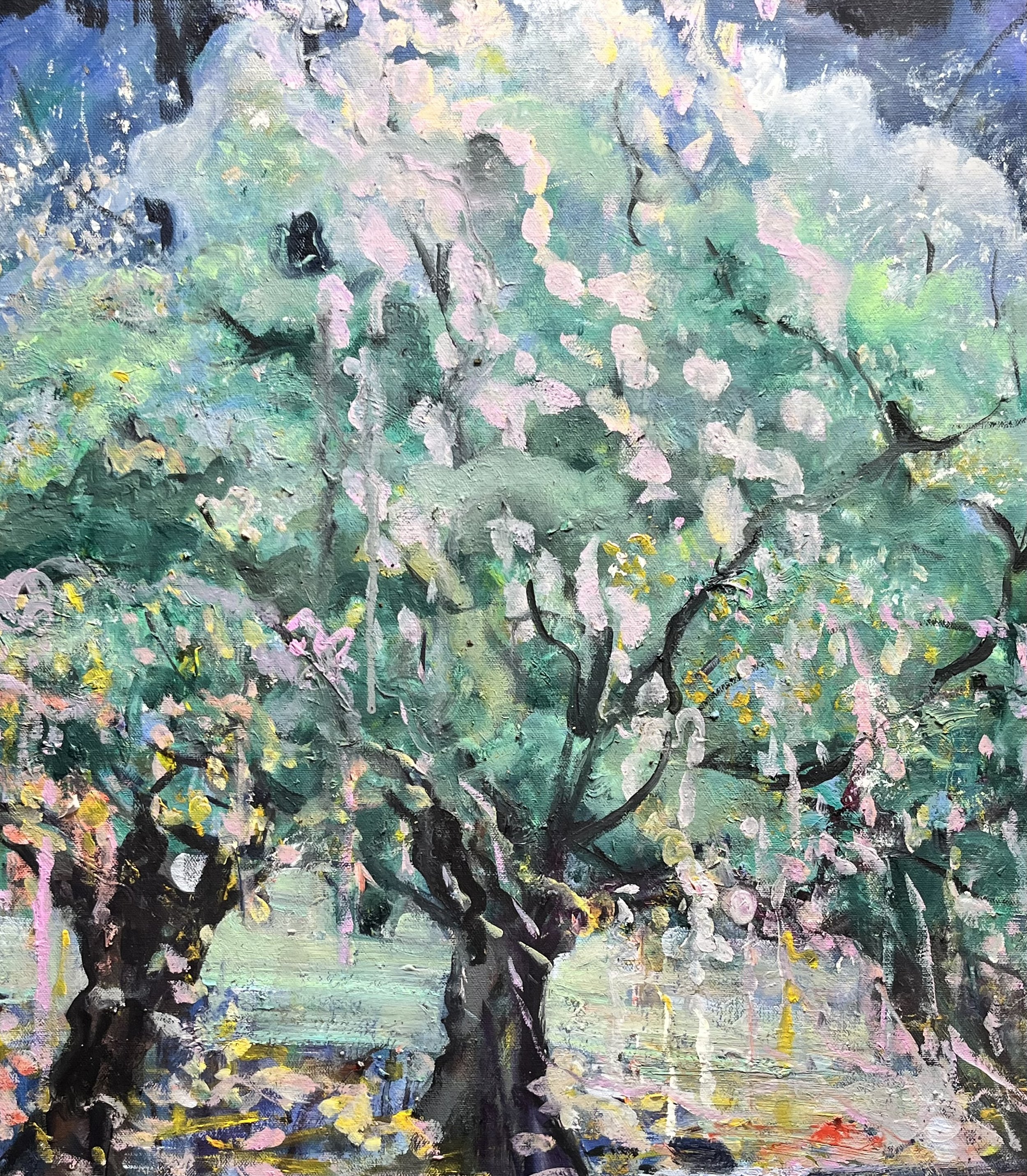
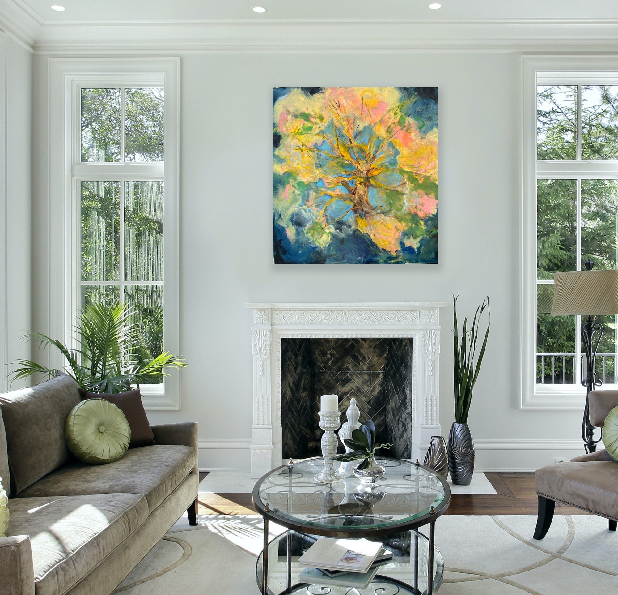
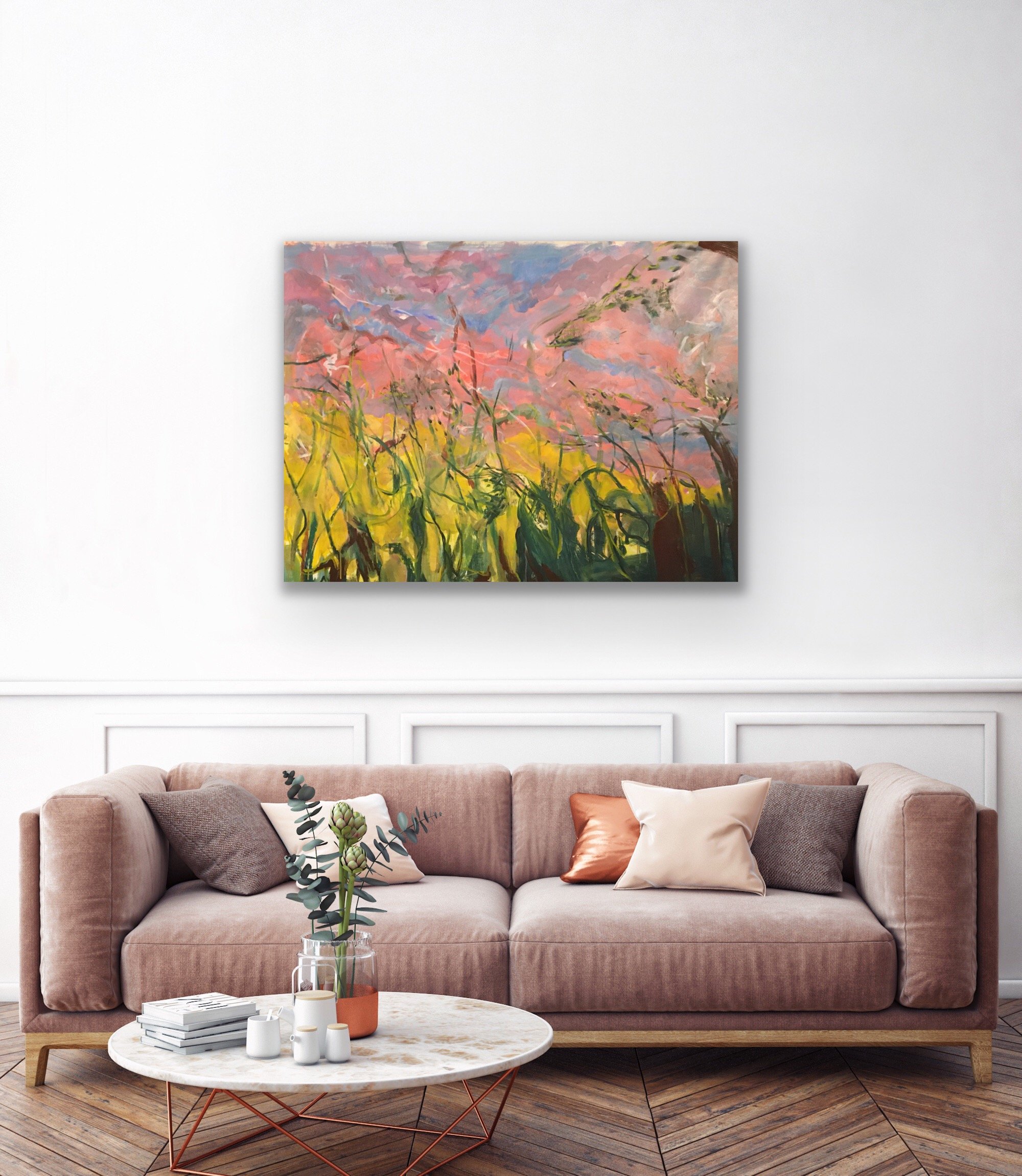
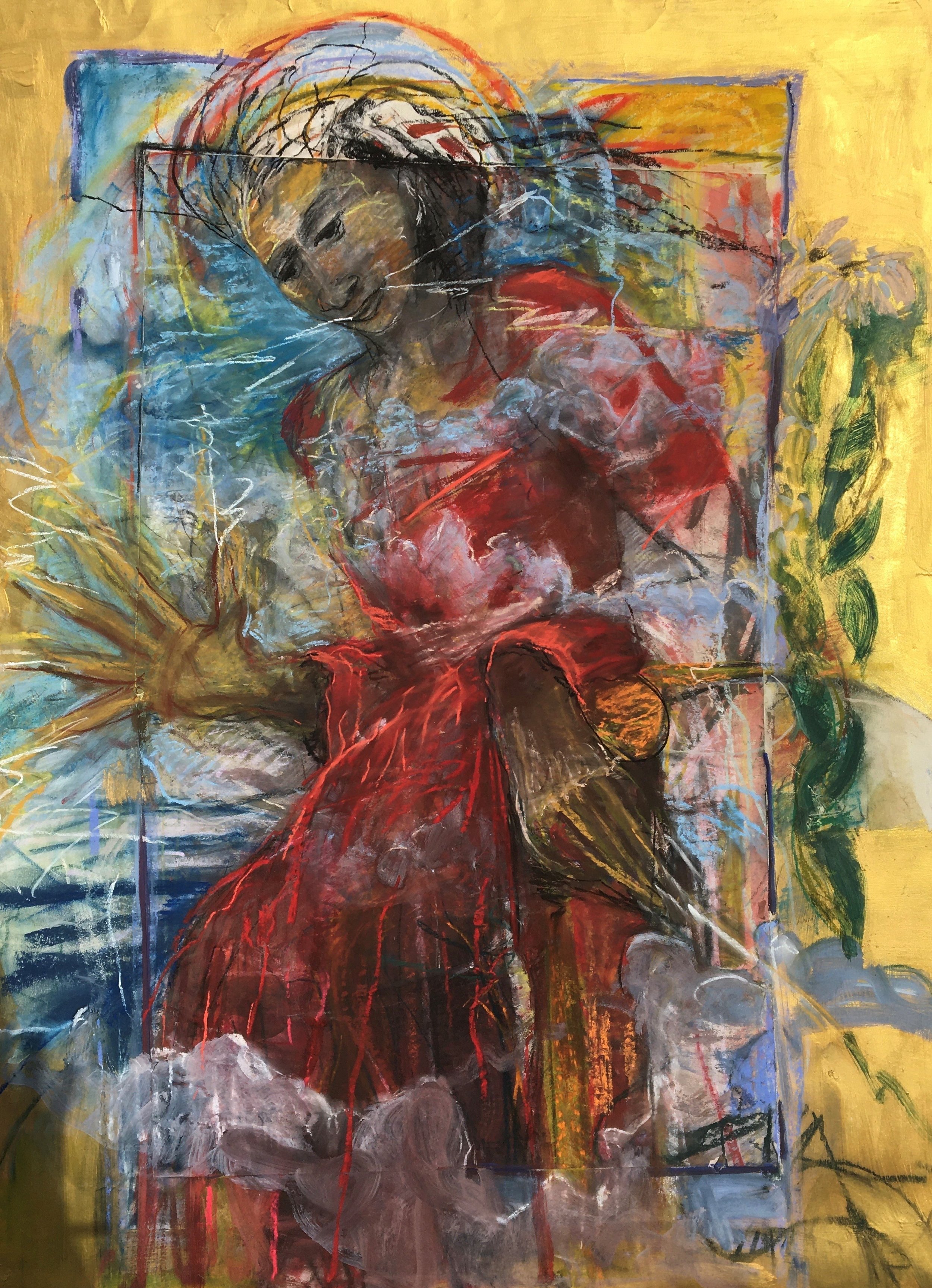
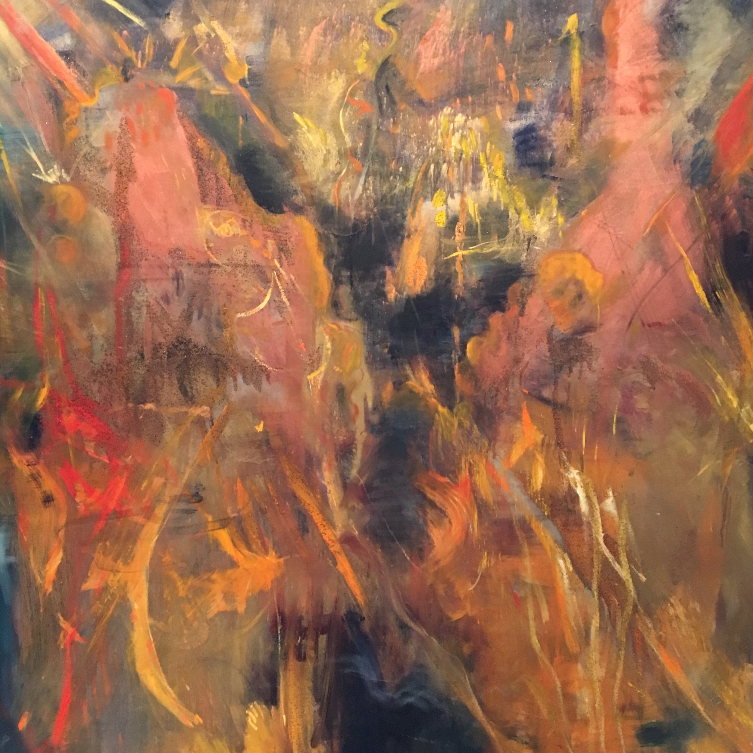
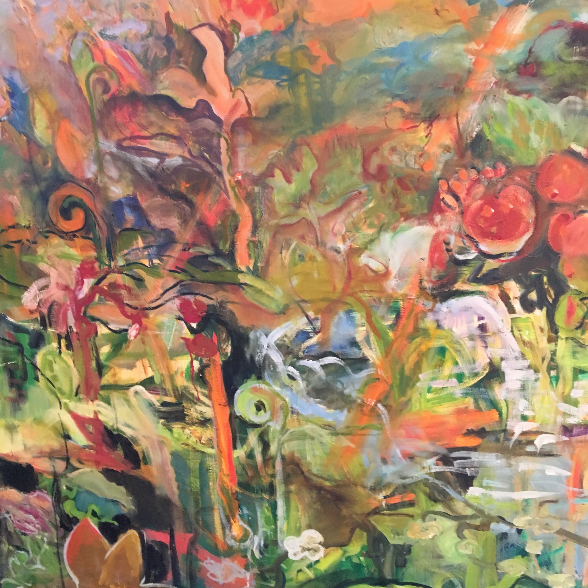
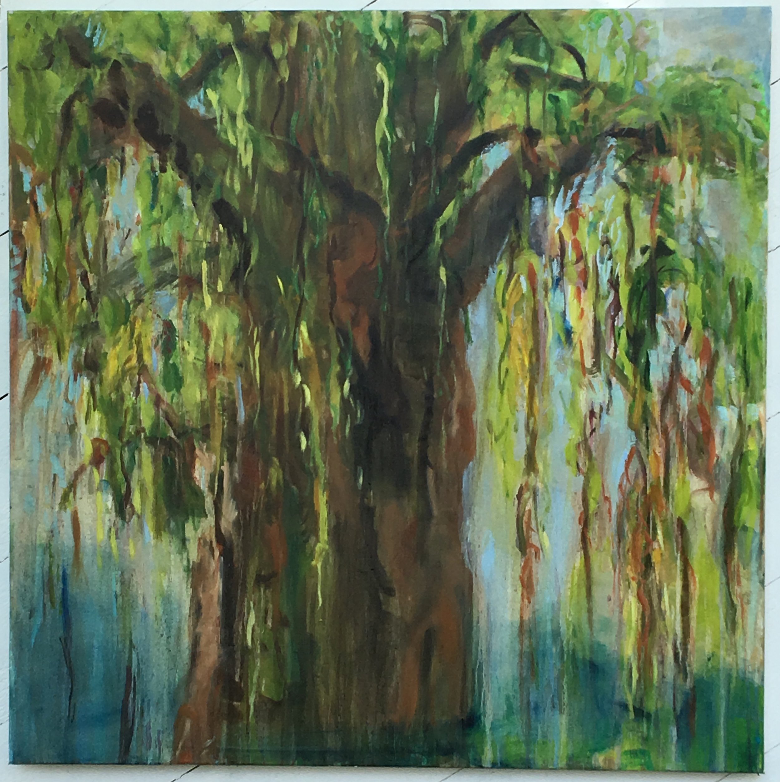
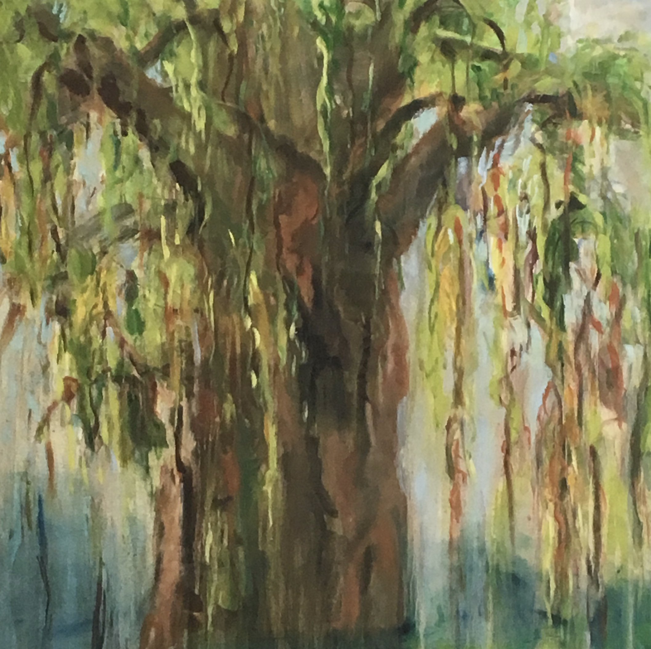
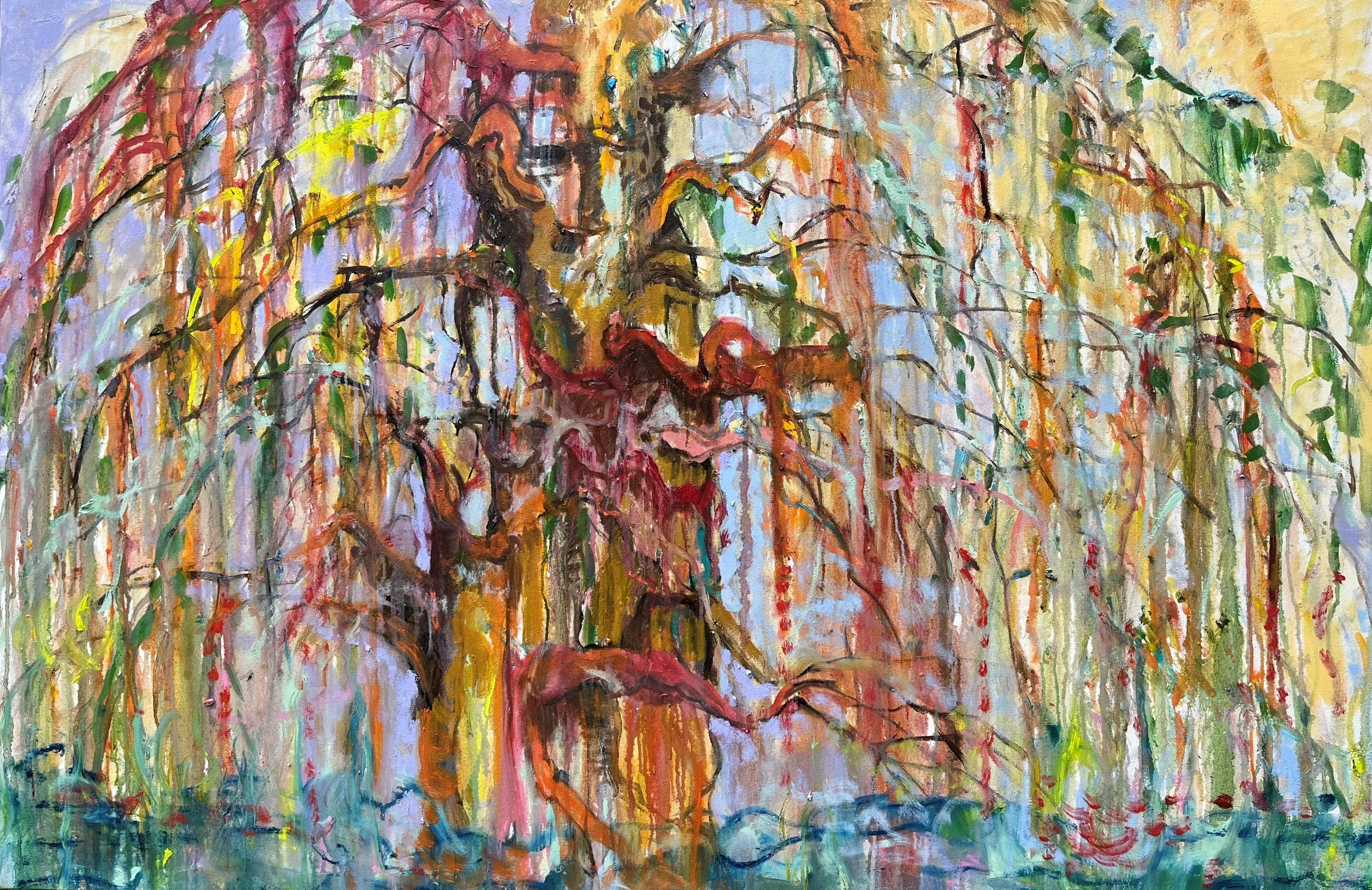
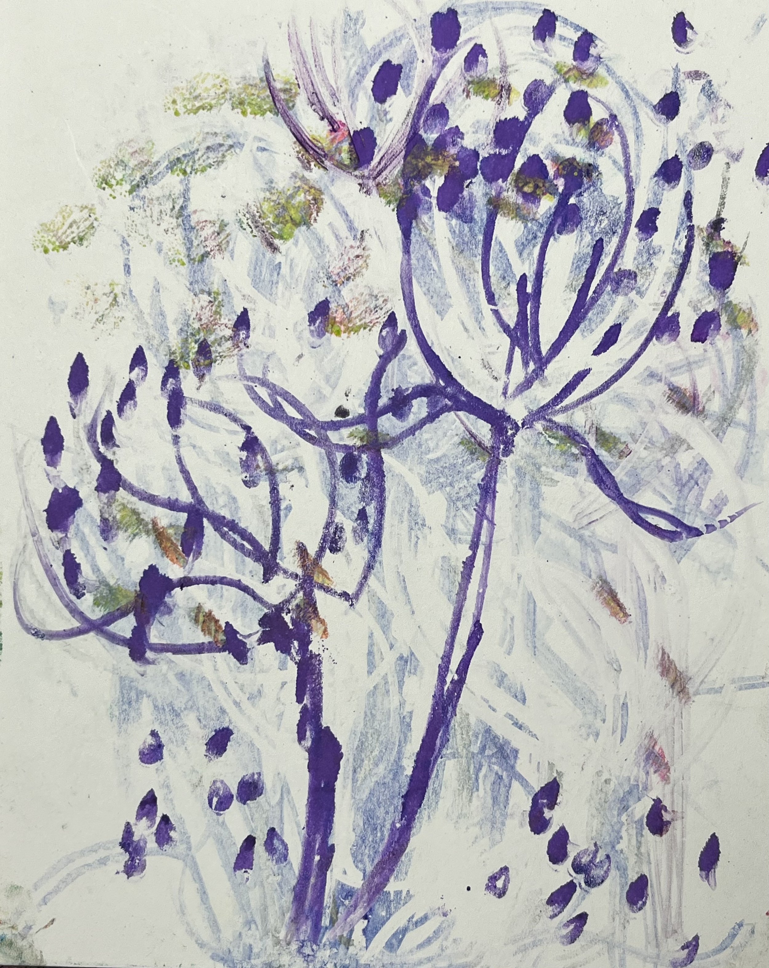
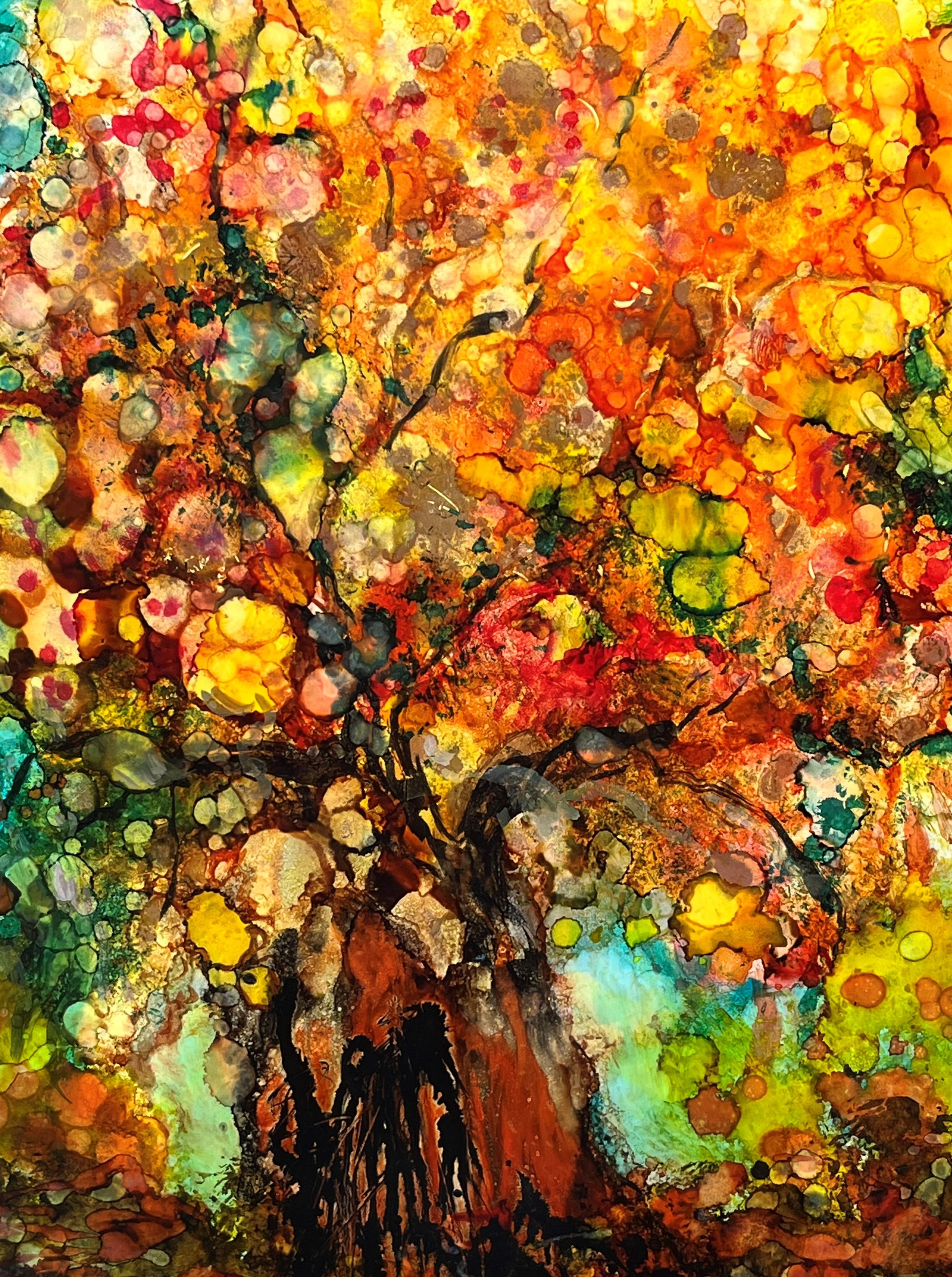
Spring Among the Thorns Oi; 30x60

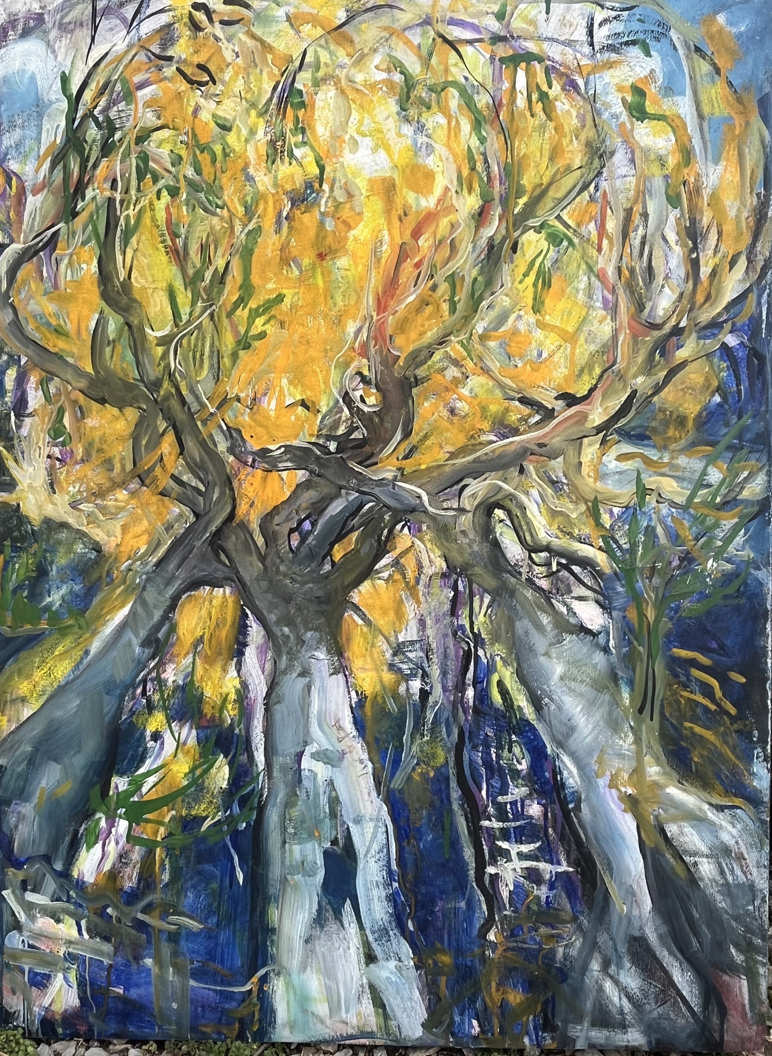
I hope we all can begin being “artists of time,” daily looking forward to the opportunities to see and create beauty in the ordinary actions of our lives. Look around at the season’s changing colors.

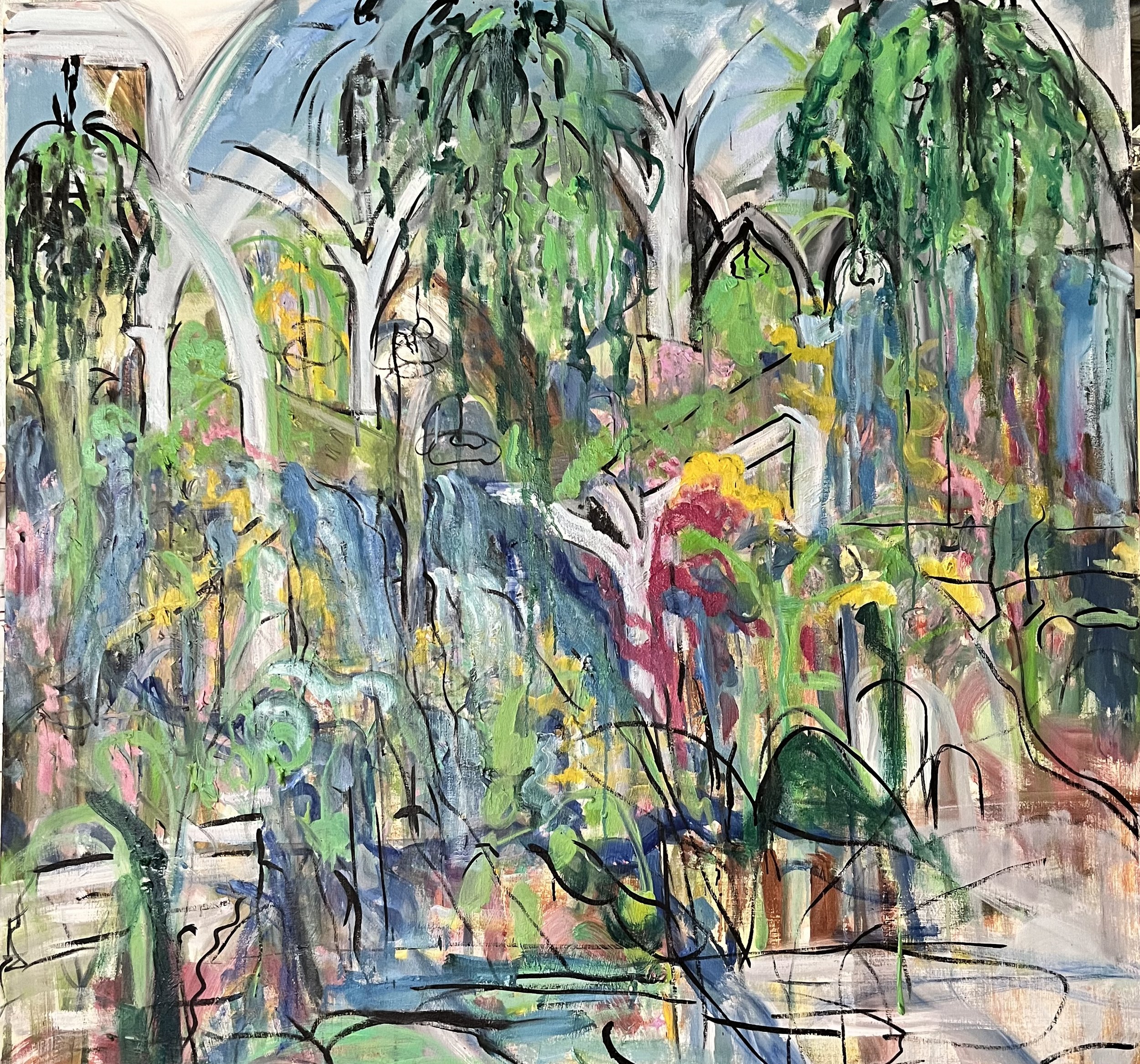
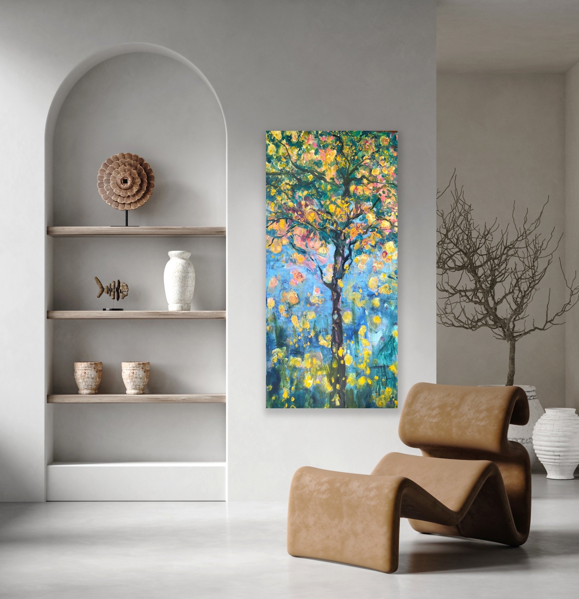
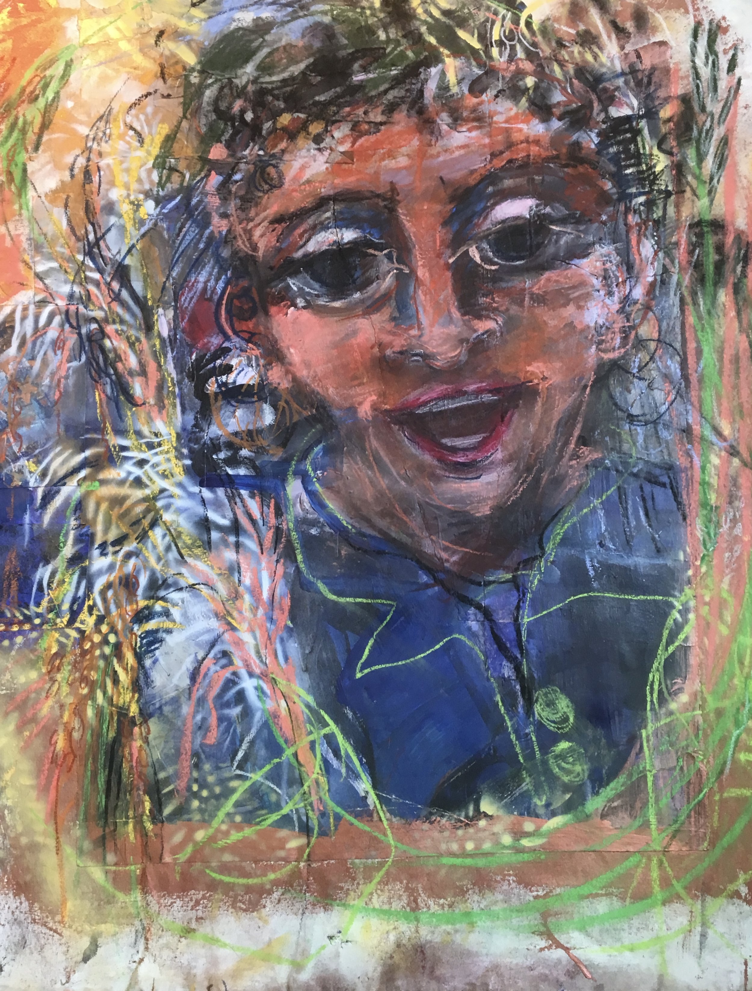
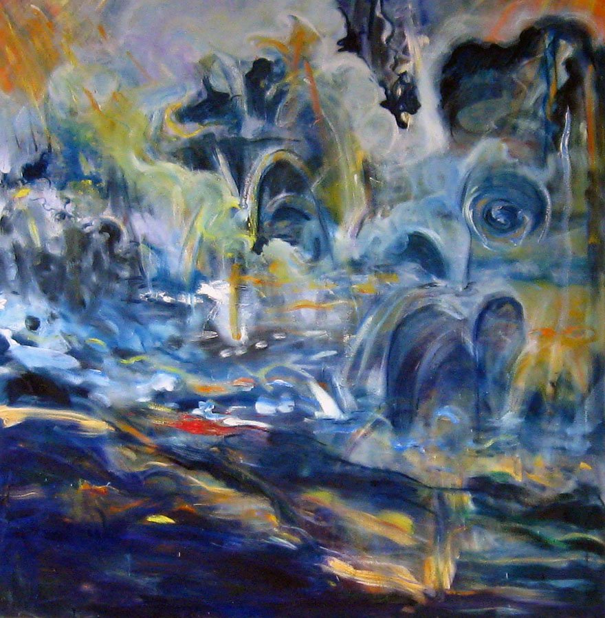
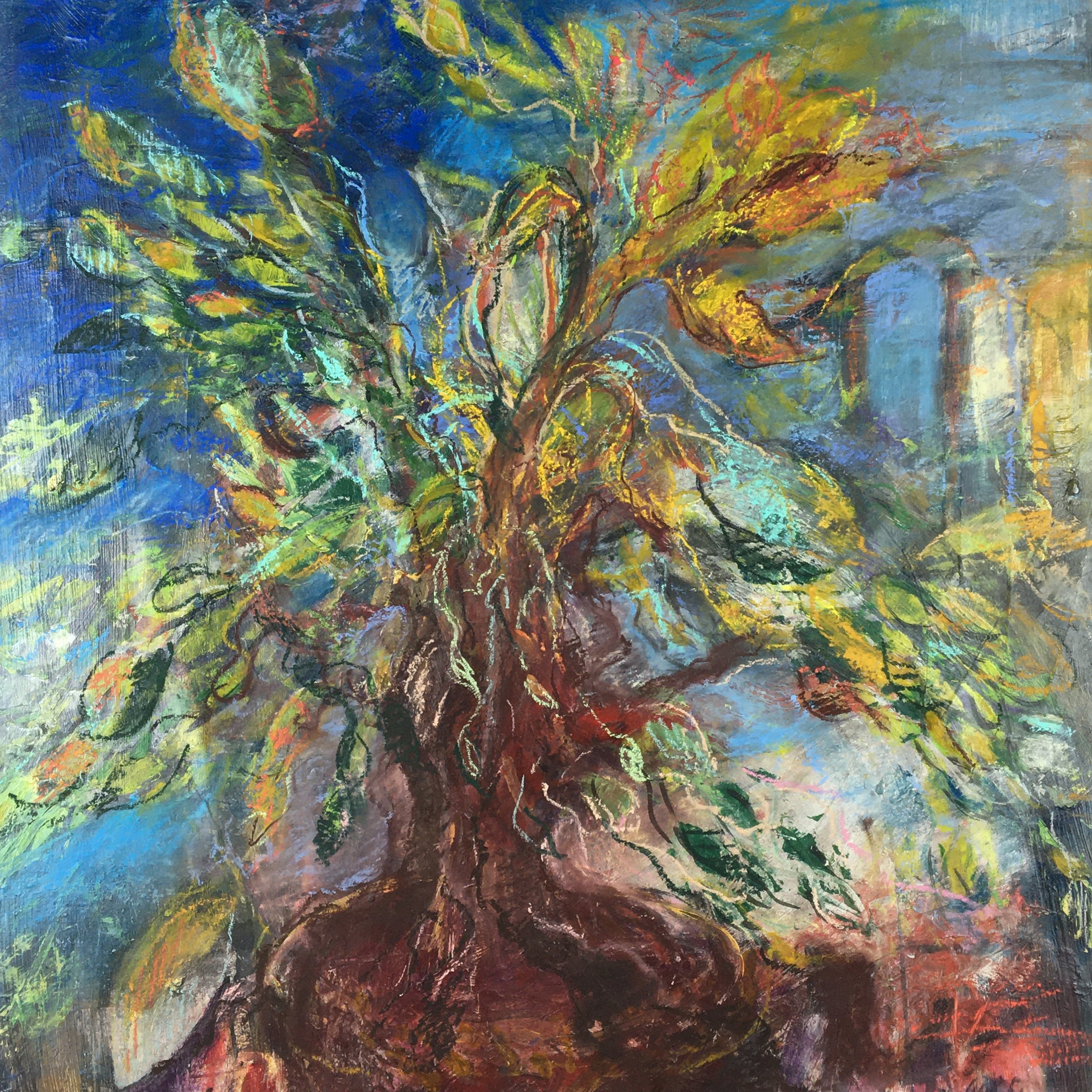
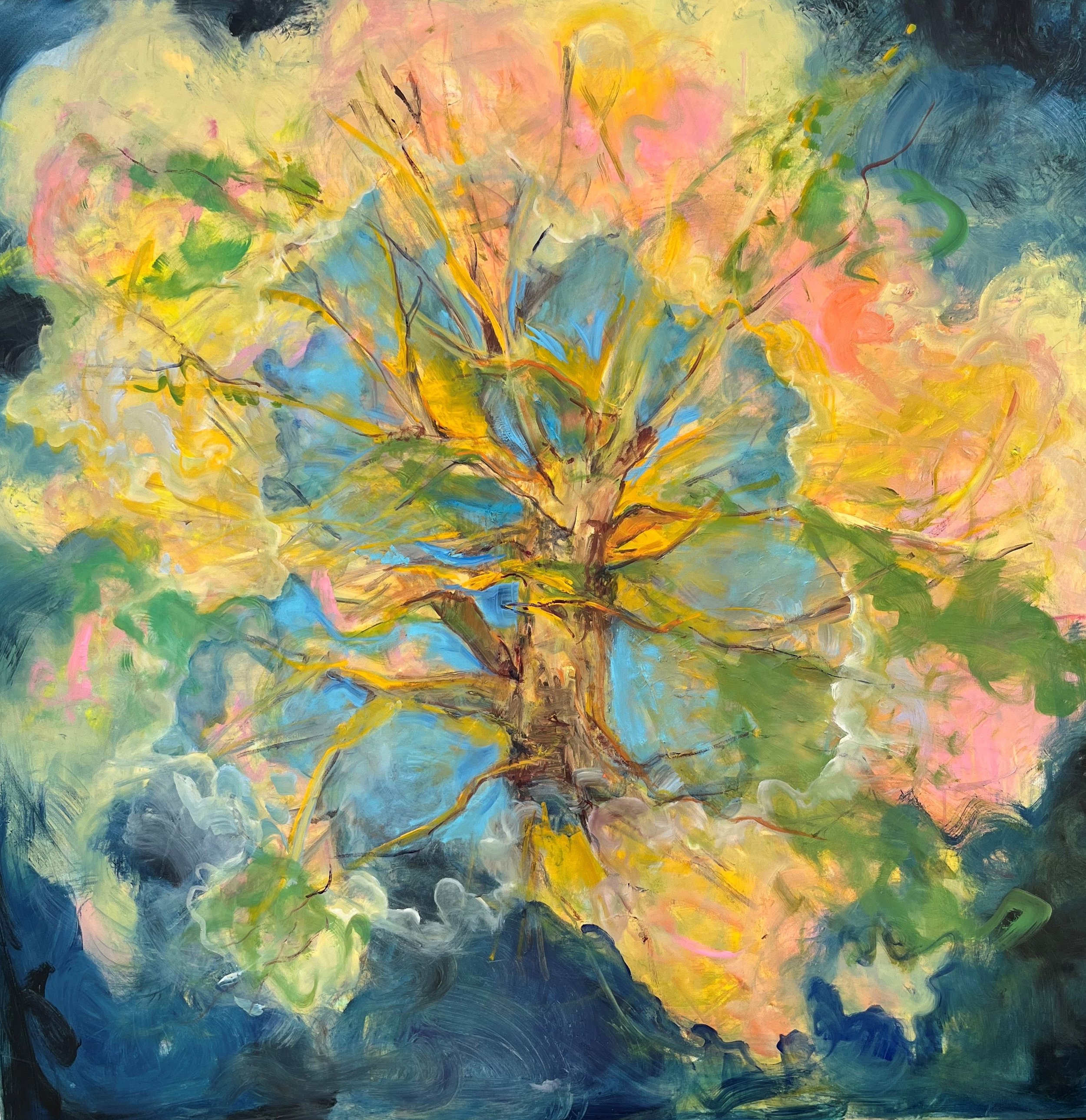
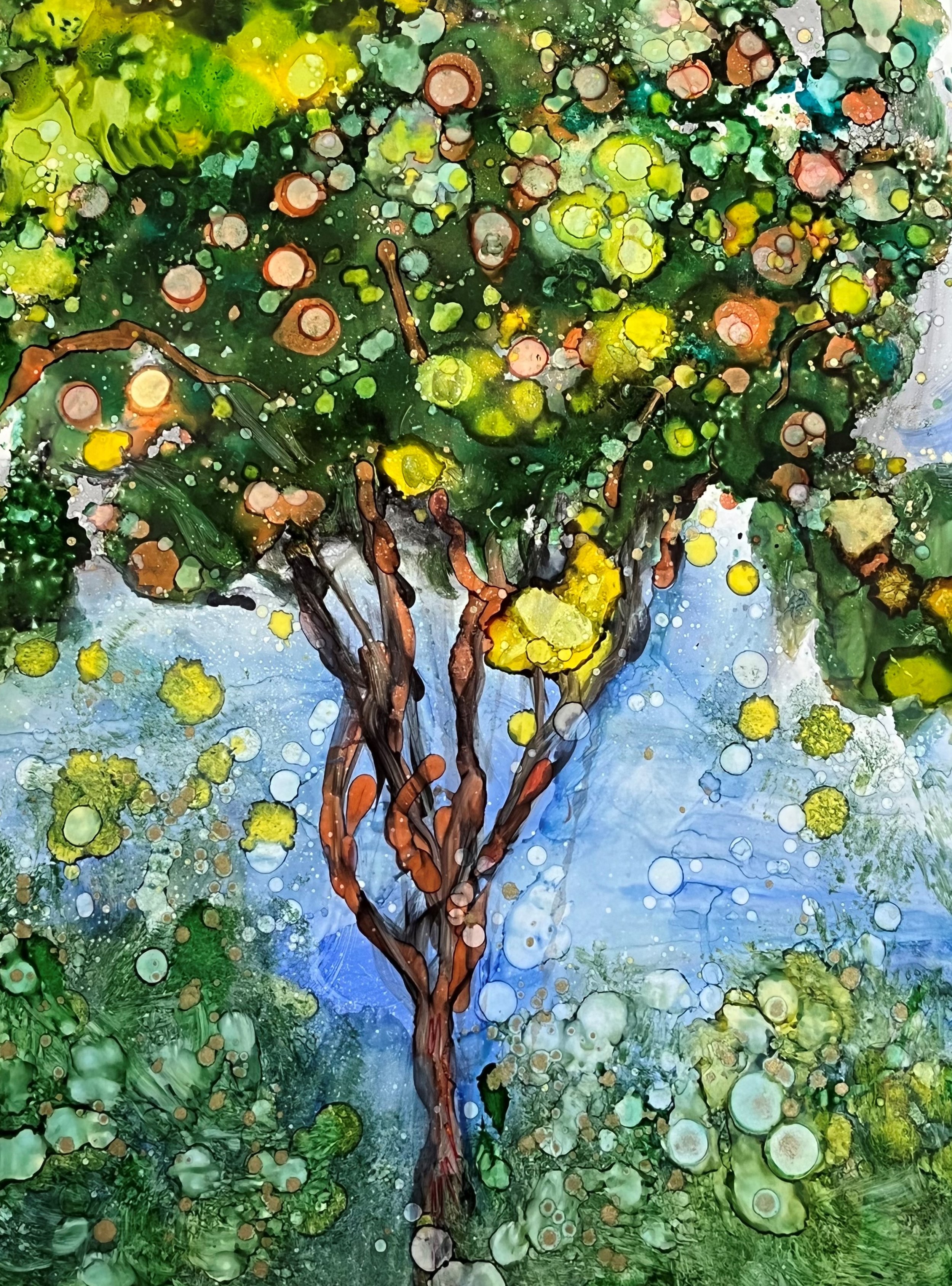
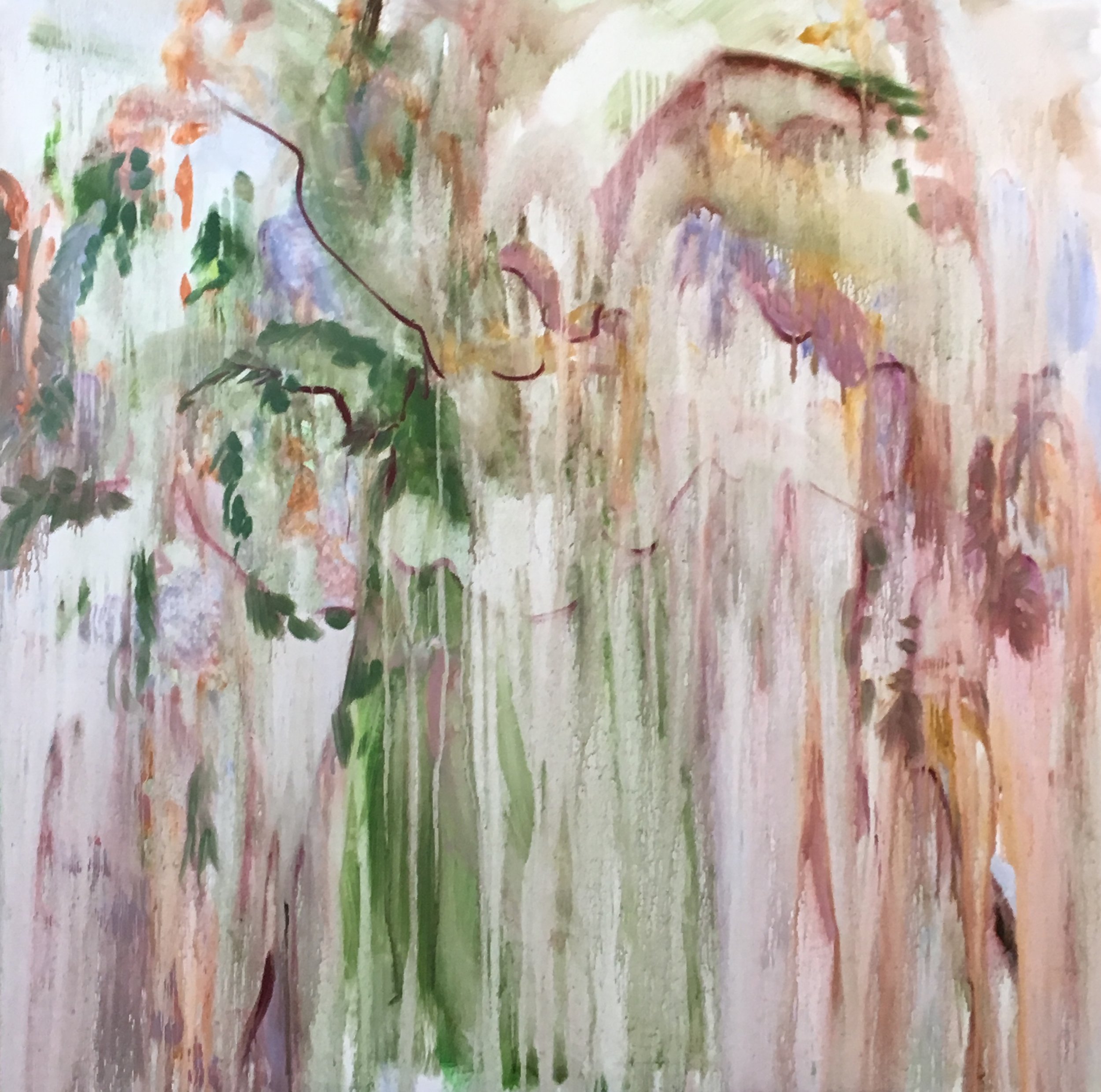
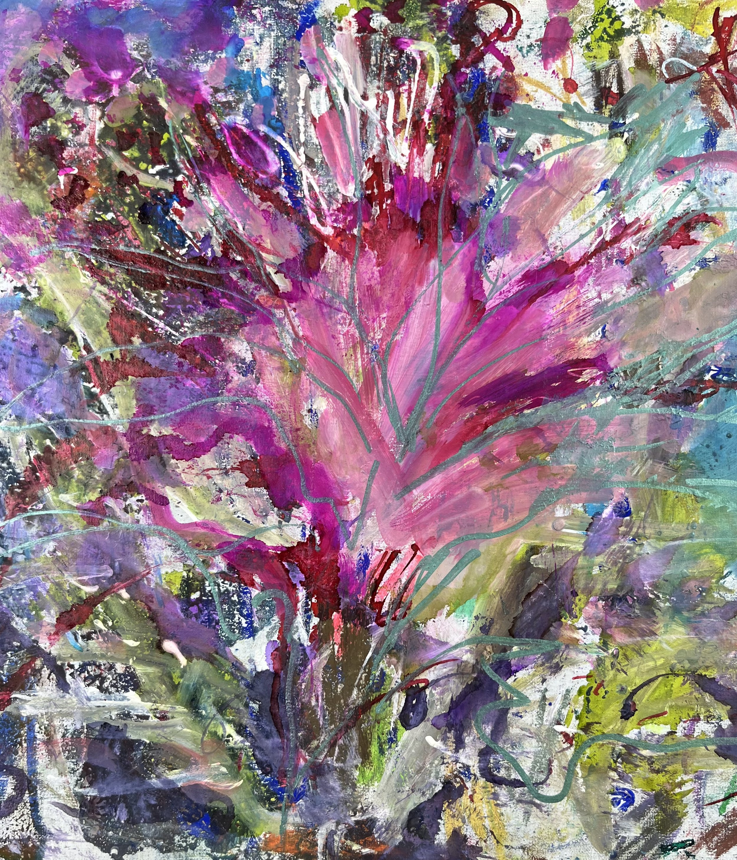
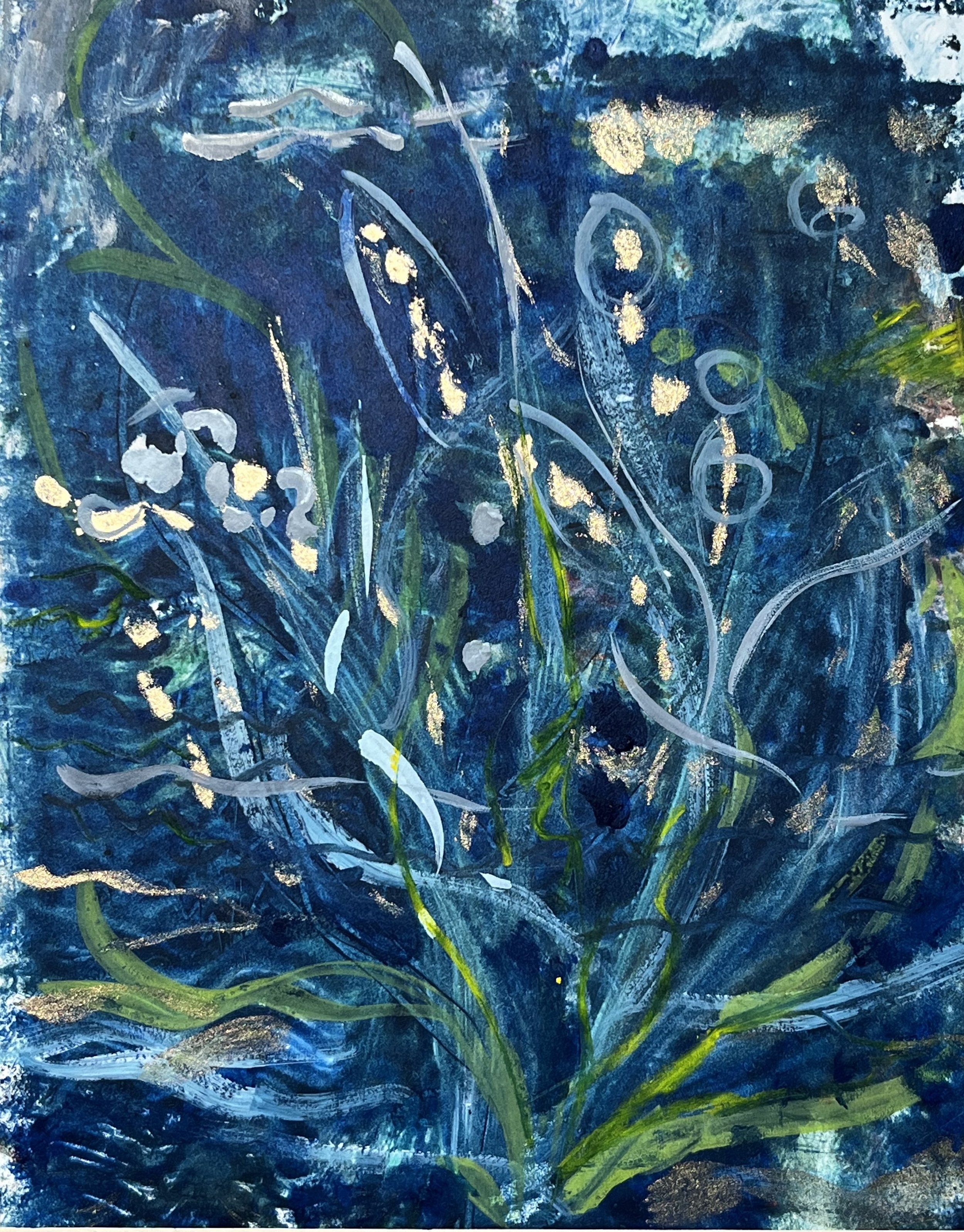
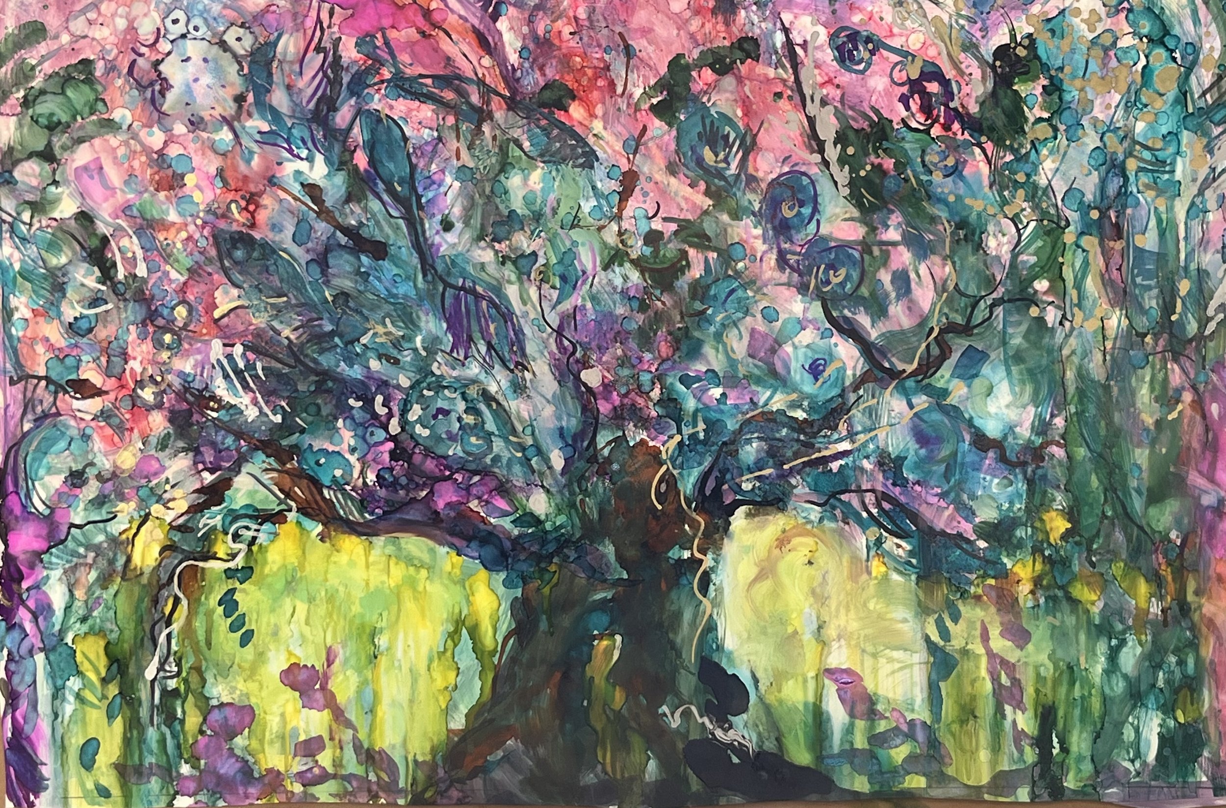
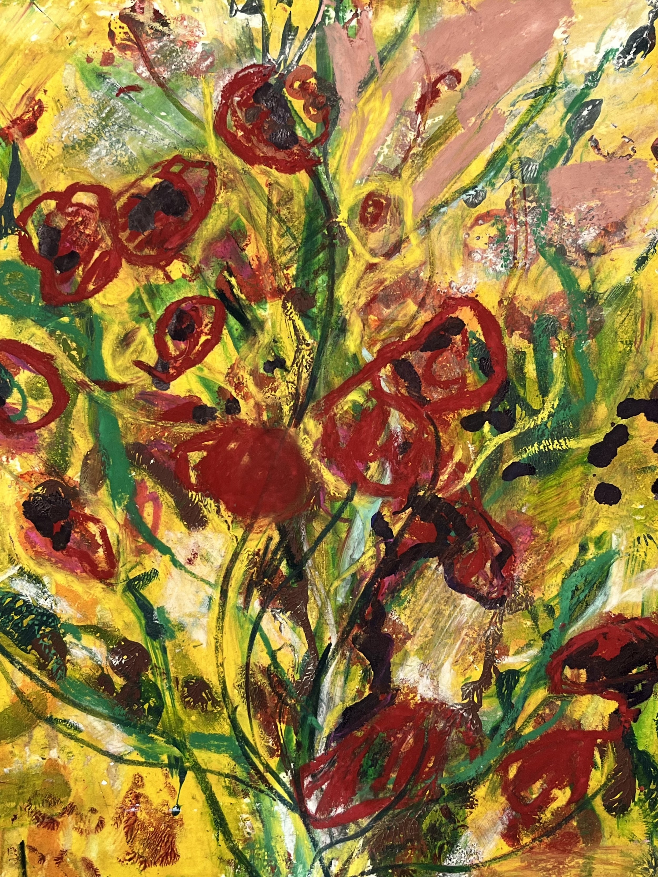
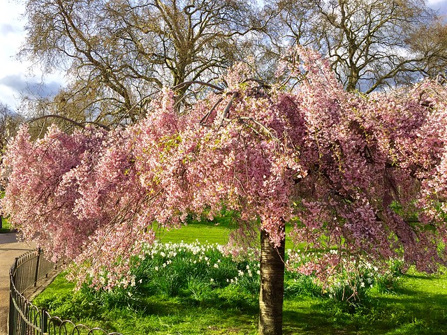
It’s Raining Blossom Oil 20x20

Peace,

Gay

If only had had taken a little time to wander and wonder

Good morning All,

Last year (2023), I contemplated a new series: “Pavilions of Splendor”

These works were meant to combine natural forms with imaginary architectural forms. My plan was to begin with the "The Hanging Gardens of Babylon,” considered one of the ancient Seven Wonders of the World. They’ve been an artistic subject for over 200 years, as the following 19th century hand-colored engraving (via Wikipedia) shows.

Almost nothing is known definitively about these gardens. (Britanica.com has a short summary.) But this very lack of knowledge, coupled with the exotic name, invited me to imagine them in an ancient, desert city. BUT I found as I began that I was not quite ready to deal with the idea yet. I needed to finish the first painting and let the theme ‘rest’ for a while because I began to overpaint each surface and end up with an undecided and struggling ‘mass’!

I actually liked this beginning but then proceeded to make a completely different painting over it!

If only had had taken a little time to wander and wonder among my imagination.

However, one painting did reach completion but in a different theme – Homage to Longwood Gardens.

Lush Garden Symphony 48x48 Oil

This also underwent several changes - more of a struggle than most. You too can start, stop and rearrange your creations.

Never give up!

Peace,

Gay

Decorting with Art - Part 2

Hello All

Today I’ll briefly follow-up on the way art can become a major influence on an entire space - a statement piece - as I showed in my last blog. Here are 4 examples of paintings installed in actual home settings of clients.

Here are the various sizes of these pieces.

The first is 30x60, second is 50x50, third is 66x66 and fourth is 64x64, each in their own way pulls a space together.

Because larger work is such a large expense and can be a huge step for clients and in each of these cases, collectors, it helps both me and potential clients to see pieces in a room setting. For this I use Artrooms.com an app which at least can show proportions within a room or setting, even if not exactly like your home..

The first is 48x48, second is 30x60, third is 48x48 and fourth is 36x48.

Are there large paintings of mine you might like to see in a room? Choose one and I’ll set it up for you to see.

Peace

Gay

Decorating With Art.

Hello again Art Friends,

Recently we had our white, old fashioned, kitchen cabinets re-surfaced. We also had new cabinet doors and drawer fronts made in our style of preference - Shaker.

We chose the Spring colors of daffodils as our inspiration

The results are, fabulous! They also showed us something we were already knew we wanted to change - our wall color! The all-purpose grey selected by the previous owners is just not ‘us’.

Greys can be beautiful and have many variations, but this one seemed bland and the lovely new colors of our cabinetry have emphasized this.

In an effort to counteract the bland gray walls, now shown up by the lovely colors of Spring daffodils, I decided to add a painting as a contrast, as we consider our next wall color choice. My first selection seemed fine until I realized it just had the same effect as our newly refinished cabinets!

Summer Fruiting Oil 48x48

My second attempt was, I think, more successful as, while echoing the colors it also introduced some contrasting elements.

Cherry Delight Oil 40x60

This is using art as a Statement Piece. To define a room or an area and as a stand-alone piece,

Tomorrow we’ll look at grouping small pieces to get a similar effect or simply bring a blank area to life.

Peace

Gay.

Swim with the Fish

We’ve been staying dry and on land - now let’s get our imaginations and feet wet!

Step into a world of enchantment with Mysterious Pool. Vibrant water lilies dance across the canvas, their delicate petals shimmering in the gentle ripples of the water. The play of light and shadow creates a sense of mystery and intrigue, drawing the eye deeper into the scene.

As you gaze upon this artwork, you can almost hear the soothing sounds of nature, feel the cool, refreshing breeze on your skin. My use of color and texture brings the scene to life, capturing the beauty and tranquility of a hidden oasis, inviting you to explore the hidden depths of the pool.

Allow Mysterious Pool, to evoke a sense of wonder and magic.

Imagine diving into a world of vibrant colors and swirling textures. That's what you get with Flashy Fishy. This painting is a mix of bold contrasts and dynamic movement, all captured on a surface that just begs to be touched.

Inspired by the beauty and fluidity of underwater creatures, Flashy Fishy features a metallic gold center surrounded by a sea of turquoise blues, greens, and hints of orange. The dense, semi-opaque technique gives the artwork a rich and textured surface, adding depth and interest to the composition, inviting us to swim with the golden fish.

I love the sense of energy it exudes. You can almost see the fish swimming gracefully through the water, their scales catching the light and shimmering in the depths below.

So, if you're looking for a piece that will brighten up your space and spark your imagination, look no further than Flashy Fishy. Dive in and let yourself get lost in the swirling colors and playful movement of this enchanting artwork.

Until next time, keep on creating and exploring the beauty of the world around you! 

With love and paintbrushes,

Gay

Spring Part 2

Hello everyone! This is the second of the 2 most recent paintings I mentioned in yesterday’s blog which reflect the power and excitement of Spring. "Color Explosion" is 11x14 mixed media painting, inspired by a desire to explore the dynamic interactions of color and a sense of movement and chaos evoked by the vibrant floral growth in my Spring Garden.  The resulting riot of colors, with dominant tones of yellow, red, purple, green, and blue collide to create an abstract composition that invites your interpretation.

I experimented with different techniques and applications of paint to achieve the desired effect. Some areas feature thin washes, while others are slightly more thickly layered, creating a dynamic visual texture.

"Color Explosion” is a celebration of the power of color to evoke emotions and spark the imagination. I hope that you will take the time to explore this artwork and find your own interpretation of its vibrant narrative.

Thank you for joining me on this artistic journey, and I look forward to sharing more of my creations with you in the future. Stay tuned for more updates and new works, and feel free to reach out with any questions or comments.

What are some of YOUR favorite memories of Springtime?

Until next time, keep creating and exploring the world of art!

Gay

Color Explosion — Gay P. COX  

Spring is Here!

Hello Friends, and welcome to Spring!

Following my 2 blog posts on Healing I wanted to introduce some new works that reflect the joy of new life after Winter. Spring is a time for explosive resurrections as nature seems to jump towards the sun’s light.

Today I'm excited to focus on one of these paintings, "Rose-Infused Whirlwind". This 11x14 mixed media piece was inspired by the beauty and complexity of nature, I created this piece to capture the essence of a swirling whirlwind infused with shades of pink, purple, red, white, and hints of blue and green. The composition features layers of textured paint and swirling gestures that convey a sense of movement and depth.

At the center of the canvas, a vortex of hues draws you in, as if we could enter the heart of a rose. Floral-inspired forms along the bottom edge add a touch of organic charm. I wanted to capture the intense energy of plant life in Spring.

In my garden I can see tulips, fritillaria and so much more all springing up sometimes by several inches a day!.

I hope you enjoy "Rose-Infused Whirlwind" as much as I enjoyed creating it. Dive into the whirlwind of emotions and energy of Spring!

Do you enjoy about Springtime? Why?

This piece, framed and ready to hang, is available in my SHOP Rose-infused Whirlwind — Gay P. COX

 Thanks for stopping by!


Healing Part 2

Hello Art Friends

In my first blog about healing, I introduced aspects of healing in our lives and my development of images based on Psalms/Songs. Next are two paintings dealing with healing in the natural world around us.

The first painting deals with healing of our polluted waters. The second one is the healing/end of war.

The Tree of Life: The Healing of Waters – Water is vital to life, so precious in many countries because it’s rare; and in the West, so often taken for granted, filled with chemicals, and polluted. I chose for the Tree’s basic shape a tree which seems to rise like an enormous fountain pouring upwards out of the earth, spouting huge swathes of crystal-clear waters. The first layers of color were transparent and semi-opaque deep blues and greens to create a feel of pure and powerful water roiling and cascading, vivifying, refreshing, and healing. An eternal fountain of refreshment.

The Tree of Life: The End of War – As current news headlines remind us daily, war is one of our most human, most tragic activities in this fallen Creation. We embrace it all too readily even as we yearn for a time when its fruits – destruction, death, suffering, grief – are no more. I started with dark reds and grays – the colors of battle fire and smoke - as the “ground” of the painting. Amid this, I set the Tree of Life, firmly rooted and definite. The Tree’s color palette suggests it is drawing war’s destruction and suffering into itself, in a mysterious but powerful transformation. The change rises into the colors of spring and summer, with scarlet and amber flowers and yellow and green foliage.

Where in our world do YOU see the need for healing?

Healing

One of the ways I as an artist have chosen to express the intense diversity of human emotion and spiritual yearning, is to create images inspired by the poetry of the Biblical Psalms. This series is titled Songs of Grief and Joy. The pieces are not for sale themselves, but high-quality prints of any of them can be ordered.

Today I’m featuring 2 of these Songs as an introduction to the series.

The first was intended as an expression of the inner nature of healing. It seems to wash away the suffering and amidst the changes a song or music emerges.

I invite you to experience "Soul Song." It was inspired by Psalm 13.

The central image is a face expressing BOTH hope and pain surrounded by a symphony of abstract marks some representing musical notes. I wanted to portray the re-animation we feel as we experience inner healing and the return of life and joy.

I hope this painting will inspire and uplift your spirit as you hope for the healing spirit in your life and the lives of those around you, as weeping is transformed by joy.

The second painting, inspired by Psalm 126, is about the fullness of unalloyed happiness.

"Harvest of Happiness" was inspired by Psalm 126, I wanted to capture the essence of celebration and gratitude as a bountiful harvest was gathered in assuring people of food for the winter months. In many agrarian cultures the wheat harvest was celebrated by a huge, joyful procession of huge sheaves carried on the villagers’ shoulders - a true thanksgiving!

A smiling face gazes at you with eyes wide open and a joyful smile, surrounded by intricate decorative symbols of the harvest and flowers intertwined within the curly locks of hair in celebration.

The use of bold and lively colors with shades of blue, orange, yellow, and red coming together add to this dynamic and energetic composition, adding movement and spontaneity to the piece, inviting you to bask in its exuberance.

What images inspire hope and healing to you?

How an Artist Style Changes - Yet stays the same - Part 2

Most artists find they need to work at other ways to earn their ‘keep’ so to speak. One way several years ago, I chose was to capitalize on a current interior design fashion - floorcloths.

Floorcloths are not a new idea. When poorer households wanted some protection and color for their wood or stone flooring old canvas sails were painted then repurposed as floor coverings. An early form of linoleum called oilcloth.

After showing these at a trade show I was commissioned to paint wall art for a restaurant in Newton MA. Below are 2 floorcloths (left 2) and two of the restaurant’s paintings (right 2).

These were designed in response to the clients’ style requests and remained up until the restaurant closed. The stylistic elements are quite different from my usual fluid painterly one, but I found the challenge rewarding and exciting too.

Again, I found the new way of doing something propelled me onwards even as I returned to my expressionism. Several years later I found this visual experience helped me as I started my mixed media and collaged series Psalms/Songs.

Peace

Gay

How an Artist’s Style Changes…and Stays the Same - Part 1.

THE BEGINNING, 1966: During a college field trip, I came across a water spring among rocks. Back in the studio, I used a “Magic Marker” and paper to capture the essence. My instructors’ response was “Ah, finally! Now you’re really painting.”

This vitality has stayed within my ‘style’ over the years. Sometimes in landscapes. but whatever my subject it remains a type of ‘trademark’ in my style.

Next, I left landscapes and began in abstract expressionism. I began by focusing on a central image to create a type of emotional composite. Here are four solitary female images. From left to right a Madonna, Ruth, Delilah and Theotokos. Through the abstraction I realized that something figurative was now re-emerging in my work.

In another series based on the Biblical Creation account in Genesis, I painted while listening to Hayden’s oratorio “The Creation” which was playing on my little red cassette tape recorder. Here, I wanted to capture the suddenness of the appearance of light, of all kinds of light, in the midst of an unimaginable void of nothingness. Again, abstraction but still hidden, gradually emerging, was form and shape. Below you can see from left to right LIGHT! Firmaments, Animals, Earth.

Can you see the thread of my ‘style’ all from my one small remnant of my first college experience?

My next post will follow this same thread through other series.

Gay


From One Came Many.

Often, when I start a new work, the creative energy it sparks carries me forward into other areas. For me, this is a flow of creativity (and lots of work!). My starting point – the painting that sparked one of the longest phases was “The Eternal Olive Tree” – a 36 x 36-inch oil painting. I saw olive trees during our visits to Spain and Israel. I was fascinated by their longevity, fruitfulness, their amazing shapes and textures, the diversity of greens in the different fruit varieties, how they were shaken and struck to drop their ripe olives.

The Eternal Olive Tree. 36x36 Oil

I didn’t want to paint a specific tree. Instead, I wanted to capture something of the “nature” of an olive tree. The tree bases seemed to me almost like dark columns of water bubbling up and swirling powerfully around to form the trunks. I tried to use my paint to grow the tree into full mature existence on canvas. But when the painting was finished, I gradually realized I was only beginning.

From this first Tree came more than 60 paintings embracing several series: Trees real and imagined, trees of myth and legend.

Trees alone, creating light, thorn trees sheltering nests or dancing to welcome the dawn.

The painting you see here is “Nature’s Breath” – is the latest.

Nature’s Breath 24x24 Oil

Can you look back and see a moment, image, a piece of writing which released an extended burst of creativity?

Artist's Block!

Recently I was a participant in a discussion about “What to do if you just can’t get started”.

There are many reasons all of us can feel unable to ‘get going’. They range from simple tiredness to major suffering. But most of us have experienced a feeling of disinterest or lack of energy around our work/life.

Occasionally this has happened to me, and I have found that making a real change in my painting technique and materials can help propel me forward.

One way I countered this was to experiment with a new medium - Alcohol Inks.

These are acid-free, intensely colored, alcohol-based dyes. These liquids must be applied on non-porous surfaces, not the traditional, prepared canvas that I’m used to. I’m using Yupo paper, which is a tree-free, recyclable, synthetic paper that has a flexible, plastic-like feel.

My first experiments were very messy. But they freed me from the incessant need for perfection (I try to remember a mantra: “Perfectionism is the Voice of the Oppressor”).

Here are my initial snapshots of a few of these early alcohol ink works. I love the jewel tones and their intensity.

The Yupo paper created size constraints: I finally chose sheets of 11x14 and 20x25 inches, which are much smaller than the typical 48x48(or 60)-inch canvasses for my oil paintings. First paintings continued my Trees theme for this new medium. Then it grew to seeds and finally forests. Finally I found we could buy Yupo paper 30 inches wide, and I increased the size of some paintings to 24x36.

What do you think and feel when you see them? I’d love to hear about your reactions.

I'm not an Artist!

I can’t count how many times I have heard this almost as a cry of desperation when adults are faced with creating art. What happened between those early days when we had NO fear?

I mean the happiness of the 2 year old child, we once were, when presented with a brush, paint and paper!

Our grandson is discovering paint and so much more right now and already demonstrates he has preferences in brush size and color choices - sparkle paints are his go to ones. He is unafraid of trying different brush sizes and colors although I sense he loves red, purple and orange - this week.

Why bring all this up? Well, here’s how I have approached this fear among adults.

First my 3 rules - for all ages.

  1. If you can’t say anything positive, then keep silent

  2. No making fun of others work OR YOUR OWN!

  3. No judgementalism about others work OR YOUR OWN!

Now let’s get to work!

  1. Pick up the brush, pen, marker in the hand YOU DO NOT WRITE WITH! This prevents control taking over.

  2. Choose your favorite color to start with.

  3. Close your eyes - yes close your eyes.

  4. With your other hand holding the paper in place draw/paint a response to the word I speak

Everyone is on ‘the same page’ so to speak - as if they all were just beginning. After this we open our eyes and look at our efforts. Then we graduate to open eyes and usually I encourage them to imagine a favorite place, or if still sensing reservations we change colors and respond to different words.

Finally, it’s any color and subject they choose!

It sounds unusual and a little complex but actually it yields something wonderful!

Discovering we CAN create beautiful as well as emotionally expressive art.

Try it for yourself!

Even an artist can learn this way. Here are 4 images. The first three show the development from eyes closed to finished tree with eyes open. The fourth demonstrates the effect on my 4th tree - The Tree of Life: The End of Weeping.

Great Art Comes In All Sizes

As a painter of larger works, it’s easy for me to forget the intimacy and jewel-like qualities of small pieces and assume they are simple, after all, if I’m painting canvases that are 4x4 or 4x6 FEET and larger! How difficult can it be to create a 6x6 INCH painting?

The answer is: “Harder than you think!”

The 6x6 inch canvas is a 36-square-inch surface, 64 times smaller than that of my typical 48x48 canvas. This has all kinds of effects. For one thing, I have to use smaller brushes. Imagine the difference between a brush tip the size of a ballpoint pen tip and a brush big enough to paint your living room wall. (I once used a kitchen bristle broom on a 72x72 inch canvas!) Below the first painting is 48x48 and the second is 12x12.

For another, I physically move much less - with arms and hands and with legs and feet - than when I work with a large canvas. I also have to be aware that the viewer’s perspective is very different: they have to stand much closer to the completed small work to truly see it in detail.

On small surfaces, I have always to be on guard against overworking that limited space. By that, I mean constantly adding or reworking details and, in the process, losing track of…the “big picture” of the small picture. The painting can end up being less than the sum of its parts.

But small paintings are not drudgery for me! Recently I rediscovered the challenges and joys of making small pieces. These included one of my smallest piece, a 5x5 inch work “Don’t Fence Me In” (which just sold).

I recently focused on 8x10 and 12x12 inch pieces, all framed and ready to hang. Four sold in one day! 

But my smallest paintings are 4x4 inches and I have found suitably small frames for them also. You can see these right here SHOP — Gay P. COX


Favorite Trees: How a memory becomes a painting

My memory of real trees - ones I've seen and touched - is like a wellspring that nourishes my tree paintings. There are two favorite trees that have imaginative power for me.

First is a tree from my childhood in England. It was a weeping cherry tree, probably a dwarf variety, next to our small pond in our back garden.

My first baby swing was suspended from this tree. And I loved being under the branches, especially laden with blossoms, and enveloped by the fragrance. I remember my grandmother carefully climbing onto a chair to hand me some of its few cherries.

Below is my "The Tree of Life: Cherry Delight." In this work, I wanted to re-create that feeling of being enveloped, under its branches. My painting brings together two separate times: Spring blossoms and Summer cherries. There is a sense of endless abundance and quiet, vibrant warmth.

The Tree of Life: Cherry Delight 40x60 Oil

Second, there are the wonderful stone pine trees that I saw on my trip to Italy. This particular pine is tall (40-60 feet typically) with an umbrella-like canopy on a thick trunk. It inspired my "Tree of Life: Fireflies Arrival!"

Tree of Life: Fireflies Emerging 30x60 Oil

The strong, assertive vertical trunk lifts the whole painting upwards. That verticality gives a sense of the gold-flashing fireflies rising to illuminate the canopy, creating a living starfield.

Do you have a favorite tree? What does it mean to you? What memories does it evoke for you?  


Facing the Face

For many years I refused to add faces to any of my figures. I would add the head but put no features in it. This seemed to reflect a rather dismal view of humanity. So I challenged myself by taking 2 years of portrait classes at The School of Fine Arts, Boston MA. My choice about detailing the human face shouldn’t be because I couldn’t draw it reasonably well. Here are 3 studies.

  1. Calm Contemplation. 2. When Irish Eyes are Smiling. 3. Color Me Too.

I found the face gradually became extremely important to some of my painting, whether it formed the entire piece or part of a total composition.

Sometimes I kept original drawings because I felt i still had much to learn from them or they were part of some future work yet to be imagined.

  1. Ruth. 2. Song 13. 3.Song 129. 4. Cherry Blossom Geisha.

Now the face comes and goes in my paintings with much more ease and appropriateness than simply refusing to create it.

We all have things we may need to ‘face’, but as I did the 2 years of classes, I realized I truly had received healing and could finally ‘face the face’ so to speak.

Life and Hope

With Spring’s new life, comes new hope.

I find myself encouraged and my spirits uplifted as I return to digging and planting in my garden.

Each season captures life both seen and unseen. Within each growing thing, there is hidden life ready to surge upwards as winter melts away and the sun warms the frozen ground. Or in the case of the desert – rainfall awakens the new growth. I will never forget, while living in Arizona, the amazing sight of the arid desert turning green and then becoming awash with color after the spring rains. For a short few weeks, sometimes only days, the desert bloomed!

The Watered Desert Blooms Oil 40x40 Sold.

For me, Spring illuminates faith.

Faith that from under Winter’s snow mantle, the desert’s sands and life’s sufferings and sorrows, hope endures and will emerge. The themes of awakening, of re-birth, of the power, vitality and exuberance of nature coming alive again is made visible in trees leafing out. I imagined lying on the ground and gazing up through a leafy canopy – dreaming and meditating.

Enchanted Canopy 48x48 Oil $4950

What in nature, inspires hope for you?

Painting as Fun

Have you ever seen the fantastic energy and fun shown by a small child discovering color and paint? They just start and go, wielding a brush almost too large for their hands or spreading paint with their hands and fingers. It’s magical to me. Sometimes I find a need to rediscover that childlike energy and fun.

One way I do this is to use a new - to me - medium such as alcohol inks. These are acid-free, intensely colored, alcohol-based dyes. These liquids must be applied on non-porous surfaces, not the traditional, prepared canvas that I’m used to. I’m using Yupo paper, which is a tree-free, recyclable, synthetic paper that has a flexible, plastic-like feel.

I’m still having lots of fun with it! My first experiments were very messy. But they freed me from the incessant need for perfection (I try to remember a mantra that my husband quotes: “Perfectionism is the Voice of the Oppressor”).

Here are a few of the earliest alcohol ink works. I love the jewel tones and their intensity. What do you think and feel when you see them? I’d love to hear about your reactions.

The Yupo paper creates size constraints: I finally chose sheets of 11x14 and 18x24 inches, which are much smaller than the typical 48x48(or 60)-inch canvasses for my oil paintings. Recently I have been able to work on 24x36. Although I started with my tree themes, I have extended these pieces to include, seeds and flowers.

Finally, I throw caution to the wind and just push things as far as I can by putting the ‘rule book’ away and seeing what happens!

Canopy of Life 24x36 Alcohol Ink.

The End of Winter Blues?

I know I’m not alone in hitting a low point during the winter months and struggling to restore my enthusiasm for painting and for life in general. This year, it was made worse by a December 2023 illness and a recent loss.

This lack of energy, motivation, satisfaction is typical of these colder, shorter days. Sometimes I just want to hibernate: drink tea, munch a biscotti, and bask in easy-watching TV shows.

But as a painter (and small business entrepreneur!), just hibernating for weeks isn’t really a healthy option. My experience is the longer the blues go on, the harder it is to shed them.

So, what to do? (This recent Psychology Today article is a helpful starting point.)

For me, actually doing something, instead of thinking and obsessing over my situation, is key. Winter blues undermine creativity, so doing creativity is a way to reclaim my energy, focus, satisfaction, and joy.

My husband had a great suggestion: work on paper, including sketching, water colors, and most recently paint sticks. It works for me because I don’t have to set up, or clean up, an array of oil and acrylic paints, brushes, rags, mineral spirits etc. My interaction with the medium, especially a pencil or pain stick, is simple, easy and I can see immediate results. It’s low-investment, low-intensity artistic satisfaction. These can now be seen and bought on my SHOP — Gay P. COX page. I think my longing for the colors of Spring and Summer won out!

Working on paper also means that it’s easier for me to work on a half-dozen different pieces at once. Which helps me combat a tendency that my former Museum School instructor Miroslav Antic warned me about: “Don’t paint six paintings on one surface.”

With paper, I’m working in smaller sizes. So, I can practice keeping the works simple, letting the lines and colors just “flow,” instead of obsessing over each and every artistic decision in a vain pursuit of perfection. As my husband reminds me, “Perfectionism is the voice of the oppressor.”

Cleaning up my studio afterwards, because it’s easier and faster, now becomes its own accomplishment, something from which I can take additional satisfaction.

And then…it’s time for tea, a biscotti, and a favorite show.

Do Winter Blues affect you too?